Category: Applications

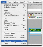
Part 2. Step by Step guide to using Fireworks to create Popup Menus

Make the rectangle into a functioning button

  1. To designate the rectangle as a button, so that it will react when your mouse rolls over it or clicks on it, it needs to be converted to a button symbol. Fireworks button symbols have some functions built in, making it very easy to create the behaviors you want.

    With the rectangle still selected (the blue handles showing), select “Convert to Symbol” from the Modify menu.

  2. Continue reading

Part 1. Step by Step guide to using Fireworks to create Popup Menus

Many people don’t realize that a tool they already own, Macromedia’s Fireworks, is one of the best for creating buttons, navbars, and especially popup hierarchical menus. Try the steps below to see how easy it is to create customized menus.

Note: this tutorial is geared for beginning web developers, with very little knowledge of HTML.

Before we start, I’ll put in my plea for restraint when using popup menus. As handy as they are, I’ve seen them overused and misused.When incorporating these menus into your design, keep them brief and closely related to the button topic they are associated with so that your users can EASILY guess what might be under each topic. If you find yourself making huge lists of popup menus with many submenus, consider reorganizing your navigation scheme. Flatten it so that it is more easily scanned, either as a whole, or in sections. Perhaps use a site map, or table of contents at the start of each section of your site.

Continue reading

iPod Freeze

If your iPod freezes up, as mine did several times before dying completely, follow these instructions:

To reset iPod mini, iPod mini (Second Generation), iPod photo, and iPod (Click Wheel)

Toggle the Hold switch on and off. (Slide it to Hold, then turn it off again.)
Press and hold the Menu and Select buttons until the Apple logo appears, about 6 to 10 seconds. You may need to repeat this step.

Tip: If you are having difficulty resetting your iPod, set it on a flat surface. Make sure the finger pressing the Select button is not touching any part of the click wheel. Also make sure that you are pressing the Menu button toward the outside of the click wheel, and not near the center.
[note: this is the tip that got it unfrozen for me]

If the above steps did not work, try connecting iPod to a power adapter and plug the power adapter into an electrical outlet, or connect iPod to your computer. Make sure the computer is turned on and isn’t set to go to sleep.

Continue reading

Making OS X more usable for seniors

In helping my father set up his new iMac, I found it necessary to modify many settings to make it easier for him to use the computer.

Although he has a strong interest in digital photography, and an active email communication with his friends, he’s always found computers to be a challenge. After years of struggling with a Windows-based laptop, he finally purchased an iMac, and it was quite a revelation. Tasks he had always wanted to be able to do now became possible. However, the OS X interface still needed adjustments to make it comfortable for him to use.

As we grow older, we become farsighted, motor coordination diminishes, and it is more difficult to learn completely new concepts. If you have never used a computer before, the metaphors we take for granted will make no sense. Icons, folders, desktops, windows all seem like byzantine concepts with no relation to the task at hand , and the entire language associated with them must be learned from scratch.

Continue reading

Breaking out of Dreamweaver for PC’s interface

If you’ve found the new DreamweaverMX 2004 for Windows interface as confining as I did, you will know the frustration of trying to get more room for your work out of the screen. I have 2 monitors, so had plenty of horizontal space, but I could not get rid of the Properties panel and other items that were taking up vertical real estate.

It took me several months to figure out that they can be dragged out of the interface. Why the actual PAGE cannot be similarly dragged, I don’t know, except that it is more consistent with the irritating way that Powerpoint’s interface behaves on a PC. An example of 2 panels hogging space is shown below with the Design and Files panels.. I realize the panels could be set to not be on top, but I wanted them OUT of there – over on the left monitor, without having to make the entire interface 2 monitors wide, which causes other problems.

Continue reading

Testing: form fields don’t display content in Safari in cloned node

The code for the 3 column layout for this blog is partly borrowed from smokinggun.com and iht.com. However now I see why they don’t put images and form elements in the article body itself!

The images and text area fields make it difficult for the script to calculate a good 1/3 column height to correctly position the duplicate columns vertically, and I’m having problems with Safari not showing the contents of text-area form fields within the article layers. I believe it has something to do with the fact that Safari uses the Apple web widgets instead of standard form widgets. Perhaps the text is on another layer that I’m not aware of.

It will take some time to work out a solution, so bear with me. I’m going to make the code in relevant pages accessible as soon as possible.

Continue reading