Making OS X more usable for seniors
In helping my father set up his new iMac, I found it necessary to modify many settings to make it easier for him to use the computer.
Although he has a strong interest in digital photography, and an active email communication with his friends, he’s always found computers to be a challenge. After years of struggling with a Windows-based laptop, he finally purchased an iMac, and it was quite a revelation. Tasks he had always wanted to be able to do now became possible. However, the OS X interface still needed adjustments to make it comfortable for him to use.
As we grow older, we become farsighted, motor coordination diminishes, and it is more difficult to learn completely new concepts. If you have never used a computer before, the metaphors we take for granted will make no sense. Icons, folders, desktops, windows all seem like byzantine concepts with no relation to the task at hand , and the entire language associated with them must be learned from scratch.
I first thought of turning on the Simple Finder for my father, but on testing that, found that it would make long-distance troubleshooting almost impossible, so I left it set to use the normal Finder interface.
Enlarge the cursor
He has a lot of trouble seeing the cursor, so after testing a variety of cursor mods, I settled on the system preference pane “Cursor Zoom” as the least problematic for him. Enlarging the cursor to 2X was sufficient.
Get Cursor Zoom here
Note: For Leopard, Cursor Zoom is no longer needed. Select System Preferences > Universal Access: Mouse (or Mouse & Trackpad) > Cursor Size, and enlarge the cursor.
Tiny Targets
Other areas of difficulty include: hitting the tiny little window-resizing corner at the bottom right of any window, manipulating the tiny scroll arrows on the right or bottom of a window, and clicking icons in the dock or in the finder just right so that the associated application actually opens, rather than a menu popping up, or shifting the icon around. We practiced mousing techniques, but I think there is something not obvious about the visual feedback that occurs when clicking.
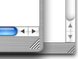
Scrollbars, window-resizing corner and arrows are too small to hit accurately.
Ultimately, it would be best to double the width of the scrollbars, scroll arrows, and zoom corner. An easy way to do this would be to lower the resolution of the computer, but this would diminish the desktop area available for iPhoto and other applications, so it seems to me that the best way to do this would be to create a special theme with extra wide scrollbars. When seeing things from my dad’s perspective, I realized how insanely small some of the target areas are – you definitely need 20/20 vision and great small-motor coordination.
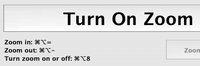
I also tried to teach the use of the “Zoom” function under universal access, but the extra key combinations required are hard to remember, and I decided to focus only on the key combinations needed for “Undo”, “Copy” and “Paste.”
The title bar’s function as the draggable portion of the window seems to be a difficult one to grasp as well. Though the left and side areas of the window chrome are draggable, they are so thin as to be unusable in this context.
Needed: an accessible theme
A more useable OS X theme might somehow emphasize the “handle” nature of the title bar area. Perhaps it could make the cursor change to a hand when over it or something, as well as distinguish it graphically from other areas of the window.
My father is pretty good at hitting the three brightly colored buttons at the top left of a window, but not too clear yet on what they all do. He never figured that out in Windows, either.
![]()
Red: Got it. Yellow and Green, not so sure.
He does know that the red button closes the window, but the concept of maximizing (the green button) is an elusive one, since it does not always act the same way. He is beginning to understand “minimize” (the yellow button), but once a window is minimized, he doesn’t usually remember that it is in the dock, so I’m not sure how useful that function is for him. The difference between closing a page and actually quitting an application is also a difficult one to understand. In an ideal situation, he would never ever need to quit an application. The reality is, that if too many applications are open, he gets confused in trying to switch from one to another. This should be a transparent process, and it simply still isn’t.
Small changes to the Finder improve usability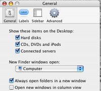
Finder: Preferences: Always open folders in a new window
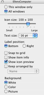

Select
View: Show View Options: All windows
- change icon size to 80 x 80
- change font size to 16 pt.
- select show item preview
The large icons and fonts make the contents more legible.
However, there is no easy way to make the System menu fonts larger. To do this, you will need to install the developer tools, and use the Quartz Debug application to increase interface resolution. See this article for details.
These settings make it a little easier to understand what folder is displaying in a window – a little more like Simple finder. Or more specifically, a bit more like the Spatial Finder as described in this article by John Siracusa
Dock Settings
Remove all extra items from dock. When in doubt, remove it! Add in the Applications folder. If you are going to be a long-distance tech-support person, add in the System Preferences icon to make your phone consultations a little easier.
Safari settings
In Safari, under the View menu, select “Show Home” and “Show Text Size”. Once the text size widget is up, click the big A at least once to make the standard text size increase. Also in Safari’s Preferences, under appearance change the default font settings to larger, clearer fonts.
Also in Safari’s Preferences, set the home page to the user’s favorite. I turned on Safari’s tabs, but it will be a while before my dad uses them, I think.
Set “Save downloaded files to:” to a folder called DOWNLOADS located on the desktop. Change the icon of that folder to something dramatic, preferably a box or something with a down-pointing arrow, or some something that will be recognized as a container.
Change the name of the hard drive to a real name – something easy to recall.
Simple Finder is good if the person doing tech support is nearby, but if you are long distance, and need to troubleshoot via phone with the assistance of the owner, regular Finder is better.
System Preferences
Under Accounts Login Options (at bottom of list of accounts)
Select “automatically log in as…. “”
This will log the user in automatically so that they never have to sign in.
Select the user’s account icon: click Startup items tab. Add any of the typical items they usually use: mail.app, AOL, iPhoto, Safari.
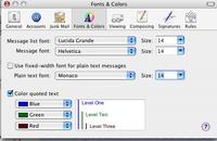
Under Appearance
Under Highlight Color select Red, Orange or Green, since they seem to have the most contrast. The default blue is too subtle.
- Select:
Place scroll arrows: At top and bottomWhen the scroll arrows are too close together they are too hard a target to click correctly.
- Select:
Click on the scroll bar to: Scroll to here
also makes it a little easier to navigate in a long document.Mail.app
Taking out the Trash
Ideally I think moving the Trash can onto the desktop would help him with executing this function better, but he seems to have learned to control-click, then select “Move to trash” so we are OK for deleting files. A description of how to put a trash can on the desktop is hereThe Mouse
The first couple of days, Dad did ask “should I right-click or left click?” a few times, but I showed him that the mouse was a one-button mouse, making right clicking difficult. Since I doubt he has ever right-clicked in his life, I imagine one of his friends mentioned right-clicking to him at some point.We spent a lot of time drilling certain terms, like “Title Bar”, “Desktop”, “Dock” “Folder” “Window” “Main Menu”, “Icon” and “Cursor” and “Upper Left” (where the name of the active application shows up) so that when on the phone we could communicate about what was happening. There are still days, however where we have problems.
“What’s wrong?”
“Well, whenever I click, I see Jacob”. (Jacob is my nephew).
“OK, click on Jacob, and tell me what word you see in the Upper Left.”
“I see…. I see IPhoto.”
“OK, click on the word iPhoto in the Upper Left” and select Quit iPhoto from the menu.”
“OK. Did it.”
“Great!”
“But I still see Jacob!!!”
“*arrgh!!!*”
I agree there should be a setting under Universal Access to increase the scroll bar witdth. This is a pretty basic feature and easily done in Windows. Apple should not assume they are ahead in the OS race when these little things are still overlooked.
It is criminal how negligent Apple is on this score. Windows scrollbars can be sized, icons increased in size, etc. Apple needs to pay attention to the fact that the population is aging. The red-yellow-green buttons are tiny on a 1600 x 1200 screen.
And re the Might Mouse: It actually is a 2-button mouse (at least now–2008) and can be configured in system prefs, but it is a ergonomic mess. Trash it and get a Logitech MX400 ($42) or some other decent Mac compatible mouse.
I’m astonished at Apples neglect in this area. I am a young able-bodied person, and even I find the small arrows and buttons frustrating to use.
The red, yellow and green buttons are pure “style over substance”. It is a real shame.
Macs are super unfriendly computers for seniors. WHy? The fonts are so small and can’t easily be read. For example, the scroll arrows and especially the red yellow and green buttons are tiny. Why doesn’t Apple allow these to be easily changed? Hell, even Windows allow this!
Thank you for a detailed article.
The question could be : why does Apple NO LONGER authorise this ? This was possible already around 1992 when System 7 was released. You could even change the font and have all your menus in Dingbats size 48 if you wanted too! Nothing wrong with the possibility of having a choice…
It worked, it worked fine, therefore it had to be cancelled ? And now you are left with just a dodgy display settings, and can only pray that it will hit something acceptable and not too distorted or too small or too blurry or any combination of the above. Fingers crossed over a crystal ball, that’s highly technical…
There are still people interested in Apple computers, not necessarily in your phones and pods, so please don’t drop us…
—–