IOS7 Visual Accessibility
Is there anyone over the age of 45 who thinks iOS 7 hasn’t been a visual disaster? I’ve been using the iOS7 interface for quite a few months now, and having seen my friends and
Continue readingSolving technology problems, one at a time
Is there anyone over the age of 45 who thinks iOS 7 hasn’t been a visual disaster? I’ve been using the iOS7 interface for quite a few months now, and having seen my friends and
Continue readingSaba People Cloud provides for settings changes through the UI for theme styles and labels. This may not be suffiicient to achieve the workflow and usability improvements you need. To do more significant theme changes,
Continue readingI work in a small learning management department in a large Health System. One of the “forever” problems we’d like to solve, is how to get out of the way of our many clinical subject matter experts and make it EASY for them to put trackable learning content online by themselves. Why is this still a problem in this age of online applications? Simply put: cost, learning curve and trackability.
Licensing costs in a decentralized environment
Software license costs are a big issue in a distributed authoring environment, particularly for departments that watch every penny. There are hundreds of potential authors out there, mostly in departments that do not prioritize the purchase of elearning software. Licenses for the big elearning software packages (Articulate, Storyline, Lectora, etc.) are not inexpensive, even with academic discounts and whatever site-licenses may exist.
Just finished reading a fairly devastating review of Windows 8 by Jakob Nielsen. I have to wonder if some of the choices they made in designing the interface were forced because of patent considerations, considering all the air has been sucked out of the room in that regard by Apple.
Worth a read, if you are wondering what to expect of a tablet interface that has been shoehorned onto a PC. Perhaps it will make more sense if they start selling 70″ touch screen high-performance tablet PCs. We’ll all work standing up next to the wall or something, waving our arms. It will be better for our figures, at least.
Continue readingSomething I’ve been thinking a lot about lately, since we have been looking at learning systems, is the idea of friction. My definition of friction is anything that either lowers our expectations of the results we can get from a particular tool or process to the point that we either change our expectations of the results or abandon them altogether.
Examples of friction include: bad usability, frustration, unexpected results, bad user experience, steep learning curves, cognitive overload, lack of critical mass of the right participants, hardware problems (slowness, breakdowns, etc.) – in short just about any sort of obstacle. It is anything that gets in our way enough to make us change what we hope to get out of the process we are engaged in, even if only slightly. Friction plays a part in how we choose to use devices, apps, and services and even what route we choose on the way home.
Continue readingSometimes a web app hits it square on target for me, and for once, Google Docs has done that with its new Drag to list to upload functionality. It’s as direct as dragging something to a folder with no intermediate step. Nice!
Continue readingThe search for the perfect WYSIWYG text editor in Drupal goes on. The best I’ve seen yet is YUI Rich Text Editor, but it still has some serious browser incompatibilities and usability problems. One significant is that there is nothing stopping users from upload a huge image, and not resizing it down using the provided resizing tools.
Now that just most cameras produce images of enormous resolution, users in my Drupal sites’ users often upload gigantic photos, which remain splashed across the entire layout until I get around to fixing them. I finally got tired of correcting users’ posts for them and fixed the CSS so it will never happen again.
Continue readingWhen browsing certain sites like Flickr on the iPad, you may be frustrated by an apparent bug in Safari that causes scrollbars within elements on the page to disappear. This can make it impossible to
Continue readingFor some reason it took me a while to figure out how to add a comment into a Google doc. I’m not sure why: the comments function is right under the Insert menu where it
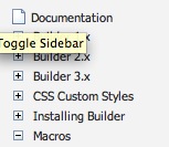
Continue readingThe pagetree plugin for Confluence is a commonly used navigation widget for the popular wiki. There are now 2 versions: the older “pagetree” and the newer “pagetree2” which has several improvements, including a less cluttered look. The older version displays the standard Confluence page icons next to each node of the tree, whereas these can be hidden (and usually are) in the newer version.
Old-style “pagetree” New-style “pagetree2”

