IOS7 Visual Accessibility
Is there anyone over the age of 45 who thinks iOS 7 hasn’t been a visual disaster? I’ve been using the iOS7 interface for quite a few months now, and having seen my friends and colleagues struggling with the same problems I have, it seems worth a post.
As eye problems go, I would count myself in the modestly impaired: I don’t need distance glasses, but I do need reading glasses. For small type I prefer +1.5 lenses, which is not even at the middle of the range of reading glasses sold at most stores. So there are probably a lot of people out there with worse vision than I have. So what on earth was Apple thinking with this new look? It seems inconceivable they would not do some user testing before releasing it, but perhaps it was so important to look “new” it overrode accessibility concerns.
Both large and small elements in the iPhone interface are harder to see in iOS7 than in 6 – enough to make it a struggle to use under some circumstances. It is not only harder to see small text, it is harder to see the fundamentals, like the phone dialing numbers and lock buttons! Really, Apple!!! It would be nice not to have to put on glasses just to answer the phone!
After using the new OS for a few weeks, I went through my phone from top to bottom adjusting things and came up with a few improvements which won’t fix all the problems but make it more usable. Here are some settings I found make it easier to see text and graphics on your iPhone:
Text size and weight
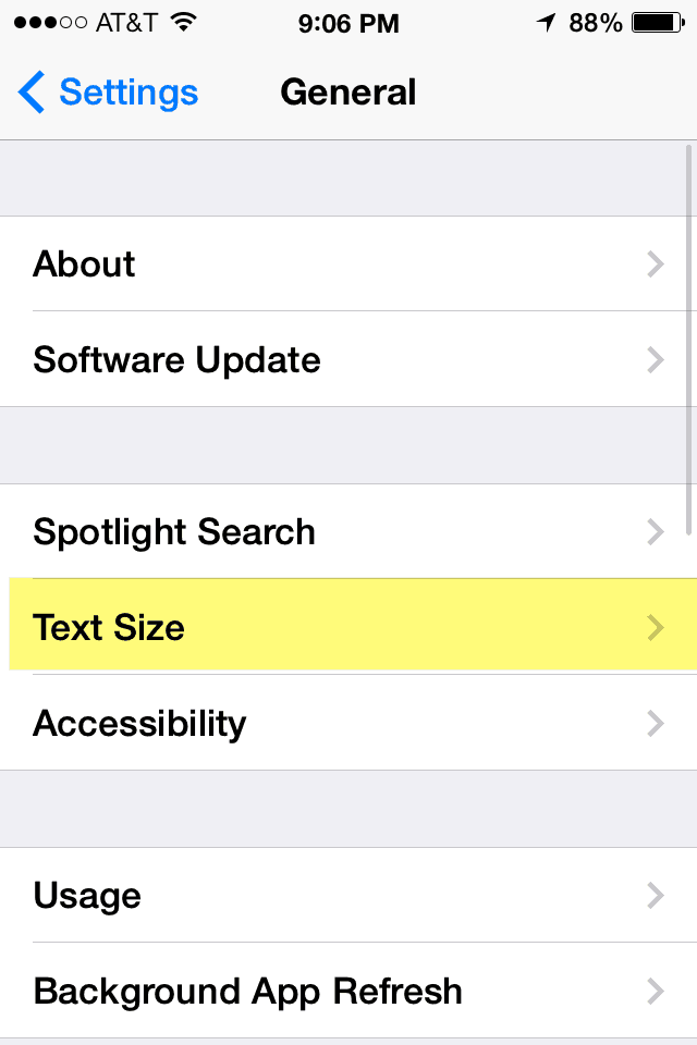
Go into Settings >General >Text Size and increase the text size. This will enlarge the text in some screens but not others. For example it will affect the list of Notes pages in Notes, but will not affect the titles under each app on your Home screen. if the text sizes are not big enough, you’ll need to ramp up to the next step: Settings >General > Accessibility.
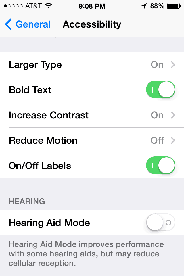
Next go to Settings >General > Accessibility.
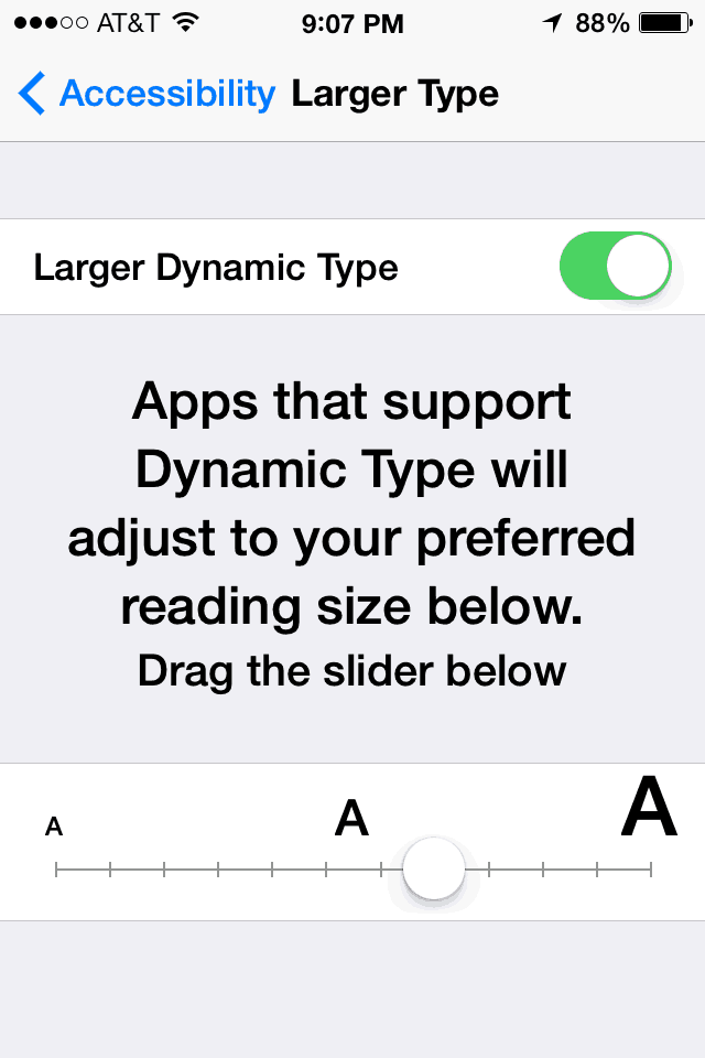
If the text size is still too small in item lists, turning Larger type on will allow you to choose larger sizes than would otherwise be available. Again, this does not affect every screen.

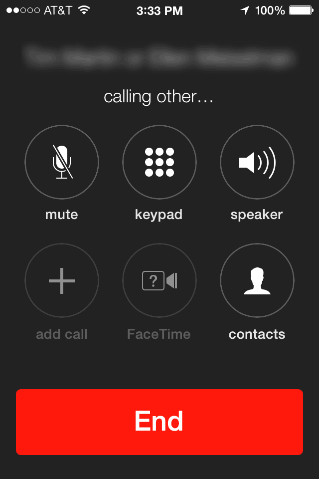
Turning on Accessibility >Bold text greatly improves the visibility of text in lists, on the Home screen and most importantly, the tiny letters in each number circle on the phone keypad. Definitely turn this one on!
This animation shows the effect of turning on Bold text on the Home screen view:
Accessibility >Vision >Invert Colors does not just invert text colors but also app icons and photo backgrounds, so I turned it back off as too confusing and ugly to look at. It is worth a try though if you have trouble seeing text and numbers on screen.
Accessibility >Vision >Increase Contrast sounds like it might be useful, but actually makes very little difference. Still it’s worth experimenting with. I hoped it would add shadows to all interface text, but no such luck.
Backgrounds and Wallpapers
The pretty gradients and image colors in many of the Wallpapers make it very hard to see text on the lighter areas. Text that shows up well in one part of the image can be nearly invisible in other areas, and those areas often contain critical information or controls. That’s the main reason designers use text shadows, but they have been eliminated from iOS7.
Text used to be shadowed on iOS 6 as shown below, and I think that might be the single most effective way to improve things in iOS7: give us the option to turn text and line shadows on.
Case in Point: White battery indicator and signal bars on a light background at the top of the Lock Screen. Nothing that couldn’t be fixed by appropriate shadows or color choices. It’s hard to believe Apple tested these backgrounds before selecting them. Turning on “Increase contrast” does nothing to improve this situation.
In case you’ve forgotten what Apple used to use to on the top of the lock screen, here’s a snapshot of the an iOS 6 lock screen, showing the way the information at the top is isolated in a black bar:
However we do not have any text shading or “add a black bar” options, so after trying quite a few wallpaper pictures and being enamored of each of them for a little while, I settled on the very last one in the “Apple Wallpaper” section, because although it is not as pretty, it is much easier to see everything on the phone! It’s black and boring, but at least I can see most of the important things.
It can make quite a difference as you can see:
Other settings worth trying:
In Settings > General > Accessibility, there is a Zoom setting which magnifies the whole screen. This can be a little cumbersome to use because you need to hit it with three fingers to zoom in and out, but it can be the difference in some situations between being able to read text and not. It’s not nearly as comfortable as just having clear text to read.
Settings > General > Accessibility > On/Off Labels makes it more obvious when the on/off toggle switches are On or Off. One thing to note: when the toggle switches are OFF they are white, which means they are nearly invisible, at least on my phone.


