Tag: usability

Friction

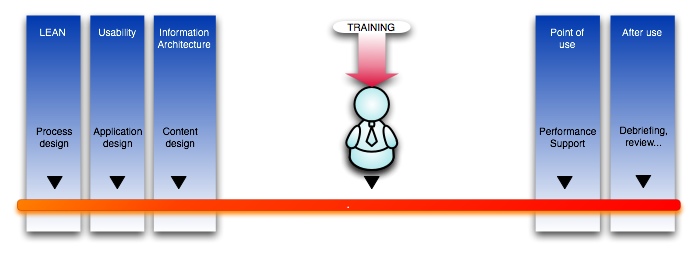
Something I’ve been thinking a lot about lately, since we have been looking at learning systems, is the idea of friction. My definition of friction is anything that either lowers our expectations of the results we can get from a particular tool or process to the point that we either change our expectations of the results or abandon them altogether.

Examples of friction include: bad usability, frustration, unexpected results, bad user experience, steep learning curves, cognitive overload, lack of critical mass of the right participants, hardware problems (slowness, breakdowns, etc.) – in short just about any sort of obstacle. It is anything that gets in our way enough to make us change what we hope to get out of the process we are engaged in, even if only slightly. Friction plays a part in how we choose to use devices, apps, and services and even what route we choose on the way home.

Continue reading

Decision support tools, performance support systems and just-in-time learning

Where is the best spot for an educational (or other) intervention?

When there is a workforce performance or knowledge gap to fill, trainers understandably think first of using training to fill it. But is more training really always the best answer? Depending on the skills involved and the characteristics of the audience, process improvement, usability improvement, training or performance support may all be worth considering.

Image

Continue reading

A brief complaint about Microsoft Windows Media Player!

A colleague at work needed to know how to turn on captions in Windows Media Player. I started to write her a note explaining it, but needed to check exactly how to get to the setting since I knew how to do it in older versions but not 11.

This turned out to be just another opportunity to experience Microsoft’s creative approach to usability.

Here’s a snapshot of the the player. Note, there is no "File" menu, no Open command, nothing that appears useful unless you are purchasing music from their store or ripping from an old CD. And really, aren’t "Rip" and "Burn" SO 2006? Who even cares about ripping CD’s anymore?

ifLooksLikethis.jpg

Continue reading

What would a truly Senior-friendly Operating System look like?

From many sessions helping seniors with their computer problems, I’ve gleaned some idea of how they think a computer should behave.

Note that the ideas listed here only apply to the current generation of seniors. It is doubtful that when the current generation of children grow old, they will have the same requirements.

My usability wish list:

  • Most important is that the interface be DOCUMENT-based, not application-based. There should be no distinction between the operating system or shell (Finder, Desktop, whatever) and the applications. In other words, there should be only one big application that does everything.
  • For example, the idea that there is a separate application to manage and edit photos and one to edit text is a needless complexity.
  • Tree-based file systems are completely lost on them – there has to be a simpler way to find documents.
  • Documents should end up in only one place, with no alternatives. They should not be asked to add meaningful metadata to anything. The computer must figure it out somehow. Perhaps they could be asked once to find a picture of each family member, and from then on, the computer could recognize that person and tag them for searches.
  • Continue reading

Dialogs too big in Vista to fit on small laptop screen

My first attempts to work with Vista have definitely been an “experience”. I’m trying to get a Lenovo ThinkPad set up for use primarily for Qwizdom and Powerpoint, which would seem to be well within the limits of what Microsoft intended, but you almost have to wonder if they ever tried Vista on a laptop before releasing it! What a mess!

The default size of windows is often just a little too big for the screen. I’ve double and triple checked the screen resolution – it is set to maximum. We did set the default font size larger than the minimum because it is too hard to see otherwise.

Yet the windows are all over the place in sizing – sometimes they are correct, sometimes obviously wrong, with title bars above the top of the screen or dialogs with Accept/Cancel buttons below the bottom of the screen.

Continue reading

Drupal admin: Changing the default Open or Collapsed state of filters and fieldsets in Node editing screens

As you add modules to Drupal, the “Edit” screen of each node can start piling up a lot of optional filters and settings that you can apply to the node. These include comment settings, input filters, image pickers and browsers, authoring settings, etc. The general term for all these added features on the node edit screen is “fieldsets.”

Most of them are collapsed when you first open the screen, which makes it easy to scroll down to the “submit” button or the lower fieldsets. However some modules set themselves to be open by default. This can be a problem if you have to edit a lot of nodes – it causes a lot of extra scrolling and is visually confusing.

Continue reading

iPhone review

I’ve been using a Blackberry 8700c through Cingular for a couple of years now, and I really like being able to check all my email accounts on it and using the google apps wherever I happen to be. Typing on it is pretty easy. However there were many reasons I was looking for a replacement.

65_47.jpg
gallery2_20070621.png

  1. Email is merely forwarded, so you aren’t dealing with the actual imap server you use when at home or work. So junk mail rules aren’t followed, any deletions or drafts are not seen by your other mail clients, etc. You used to be able to set up filters on the blackberry web client, but they removed that feature last year.
  2. Continue reading