Getting back my Windows drive shares on my Mac
Samba sharing has improved greatly on Panther, but it is still possible to get completely cut off – and not very obvious how to fix it. Here are some suggestions for things to try.
Continue readingSolving technology problems, one at a time
Samba sharing has improved greatly on Panther, but it is still possible to get completely cut off – and not very obvious how to fix it. Here are some suggestions for things to try.
Continue reading |
| “going UP!” |
Eggivation!
After he had been back in the goldfish tank a while, I got the idea that changed Eggdrop’s life. I installed a bubbler in the tank to aerate the water at the bottom better, since the tank was pretty tall. One day we looked over at the tank and there was Eggie, shooting up to the top of the tank on a geyser of bubbles.
After watching this for a few weeks, I got another idea – give him MORE bubblers. I put a row of four bubblers across one half of the tank’s back wall. Eggie took to them like he had been born to fly! He would surf from bubbler to bubbler for hours. When tired, he would sink down and go into a flower pot to sleep.
Continue readingIf the background-image property you have set in a stylesheet displays on PC, but not on Mac, make sure you haven’t accidentally specified the height or width of the div without a unit designation (i.e.
Continue readingWhen editing Questionmark Perception’s quiz templates, you will quickly find that you must not use the # symbol in hex color names, since Perception recognizes it as a comment. In redoing a complicated quiz template
Continue readingIf your AOL suddenly stops connection or never would connect on OS X, here is a possible solution: Do you connect through a Linksys Router? If so, go to their site and get the firmware
Continue readingEggdrop was born with “flotation-disorder” which means he can’t swim! He rolls around helplessly in the water, sometimes floats near the surface, sometimes sinks to the bottom, and generally has a tough time getting anywhere. His floppy little fins aren’t very strong either – he doesn’t have any reliable means of propulsion or steering.
So how does he get around? It depends on what kind of day it is. If it’s a “sideways” day, he scrabbles about sideways like a crab, using one fin to push along the gravel, and the other for stabilizing, with added boost from shooting water out of his mouth like a squid. If it’s a “headstanding” day, he bounces along on his mouth, like a balloon.
Continue readingThe single biggest mistake I make REPEATEDLY in editing Questionmark’s templates is: ::drumroll:: adding in the # symbol in color specifications. Questionmark interprets the # symbol as a comment, and omits everything after the #
Continue reading
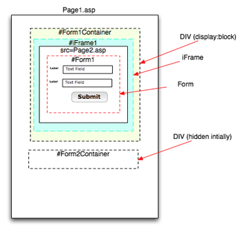
How do you cause events to fire on the parent page of an iFrame’d page?
Take this page structure:
Page1.htm
–DIV id=”Form1Container” (display:block)
—-iFrame name=”iFrame1″
—–Page2.asp
——Form id=Form1
–DIV id=”Form2Container” (display:none)
—Form id=”Form2″
Note to self: USE THE RIGHT DOCTYPE!
One of the first things we web developers usually do upon starting to using CSS is to try to recreate our old HTML multi- column layouts. which were invariably built with tables.
This turns out to be quite a challenge, particularly getting columns to be equal in height. In other words it’s difficult to get CSS-styled elements to act like a table.
I’ve found that many of the so-called 2 and 3-column CSS-only layouts get around the difficulty of making equal-height columns by using a background image in a container div that makes it appear as if the columns have backgrounds which are the same size. Clever, but it adds a little complexity and some inflexibility to the layout.
When I was first starting to convert my pages to CSS-based layouts, one of the methods I tried was to surround the columns with a container element which I hoped would transfer the height of the tallest div to the other one through the use of "height:auto" and "height:100%". It was a dismal failure, but I learned a few things in the process. Here’s what I tried:
Thanks to to the problem of Internet Explorer for PC not displaying PNG’s correctly, I can now use them in the mostly-PC user environment I develop for. I have to say, it’s been a freeing
Continue reading