Category: Information Architecture

An ontology of Collaboration patterns

In trying to gain some understanding of collaboration patterns, I came across an interesting article that proposes a layered ontology or model of collaboration that reconciles the many ideas on collaboration patterns expressed elsewhere.

Towards an ontology of collaboration patterns proposes a “collaboration stack” which clarifies the relationship of collaboration patterns to collaborative services and to the underlying communication technologies.

Continue reading

Confluence: create structure to help new wiki users get started

Once you’ve created a shared online space for your coworkers, you may discover with some frustration that it doesn’t receive the level of interest you are hoping for. One reason for this reluctance to contribute may be lack of structure. Wikis don’t make a lot of assumptions about how you want to structure or navigate through your data, and this lack of structure can be confusing and somewhat intimidating to users, particularly if they aren’t sure where to put their information. This confusion is not limited to non-technical people: I’ve seen IT community sites and wikis lose members largely because of poor planning and navigational cues.

Although theoretically, the ability to add labels or tags to wiki pages eliminates the need to put them in any particular location within the site structure, people still like to know “where they are” within a site because the relationships between documents carries a lot of information about the significance of the document itself. Users need clues as to what else might be there and what to expect when they click to other pages.

Continue reading

Decision support tools, performance support systems and just-in-time learning

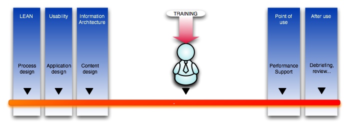
Where is the best spot for an educational (or other) intervention?

When there is a workforce performance or knowledge gap to fill, trainers understandably think first of using training to fill it. But is more training really always the best answer? Depending on the skills involved and the characteristics of the audience, process improvement, usability improvement, training or performance support may all be worth considering.

Image

Continue reading

The Problem with Slashdot and other web archives

Something that’s been kicking around in my head for a while, is the fact that I find most large web archives and blogs frustrating to various degrees. Including my own site!

The frustration has to do with what I would call, the “opacity” of sites to browsing, to discovery of information you do not know is there, and could not find because you aren’t searching for it directly. There are times I am in search of “information inspiration”- the serendipitous discovery of what I really wanted to know but didn’t know it.

Of course many sites have great search engines, and categorize articles by topic. But I feel that doesn’t go far enough. There are times when I am not even aware of the right WORD to describe a concept, but could recognize articles associated with it if I scanned them for a second or two. Or I am aware of the right word, but want some way to find ideas related to it serendipitously. This is what I call information inspiration.

Slashdot (and many other news sites and blogs) are date oriented. What happens to the articles after their moment in the sun, though is that they become increasingly buried. If you browse by topic, you still are unlikely to see them, since there are so many under each topic. Slashdot’s design discourages searching for topics.

First I have to say: don’t get me wrong. This is not meant as a critique of Slashdot per se: I LOVE Slashdot. I read it every day, and have for years. However, I feel like something is missing in general from our arsenal of navigation techniques on the web, so I am using Slashdot as an example here.

Continue reading