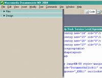
If you've found the new DreamweaverMX 2004 for Windows interface as confining as I did, you will know the frustration of trying to get more room for your work out of the screen. I have 2 monitors, so had plenty of horizontal space, but I could not get rid of the Properties panel and other items that were taking up vertical real estate.
It took me several months to figure out that they can be dragged out of the interface. Why the actual PAGE cannot be similarly dragged, I don't know, except that it is more consistent with the irritating way that Powerpoint's interface behaves on a PC. An example of 2 panels hogging space is shown below with the Design and Files panels.. I realize the panels could be set to not be on top, but I wanted them OUT of there - over on the left monitor, without having to make the entire interface 2 monitors wide, which causes other problems.
Ads by Google
Posted by ellen at April 19, 2005 12:11 PM
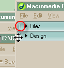
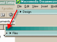
To tear off the palettes from the main interface, rather than simply closing them, click and drag on the 2 columns of dots on the left side of the pallette's title bar.
Holding down the mouse, drag the panel off to the left until it pops out of its spot.
Unfortunately, I don't believe there is any way to reproduce the "Move to new window" behavior that exists on the mac. In Mac-based Dreamweaver, right-clicking on the tab of any page produces a contextual menu which allows you to select "move to new window." If you are working on dual monitors, or a large monitor, it's often much easier to have 2 documents open side by side, freestanding. The PC interface does not allow this, apparently, without resizing the entire Dreamweaver window.
Ads by Google


