December 30, 2009
ActionScript 2: Nested button events
Sometimes it's helpful to have a quick reminder of how button events work within nested clips in ActionScript 2.
[ TRY DEMO ]
A button nested inside another button OR inside a MovieClip that has buttonEvents assigned to it will not work. (Button events include: onRollOver, onRollOut, onDragOver, onDragOut, onPress, onRelease and onReleaseOutside).
This is due to the way Flash captures events: the first parent instance with a button event handler assigned to it is the one that is listened to. None of its child objects will be listened for unless you use a workaround.
In the demo, example #1 works because the red rectangle is simply sitting directly on the Stage. It IS the parent instance in this case.
#2 does not work because the red rectangle button is now inside another button, and buttons have button event handlers automatically assigned to them.
#3 works because the red rectangle button is inside a movie clip that does not have any button event handlers assigned to it.
#4 is the same as 3 but does not work because the parent movie clip now has a button event handler assigned to it.
The complete bible on dealing event handling and propagation in nested buttons and MovieClips in AS2 was written by Senocular [here]
Senocular lists several workarounds, including delegating a parent instance's events to its children, using hitTest to manually detect events, and a combination of the two methods.
December 27, 2009
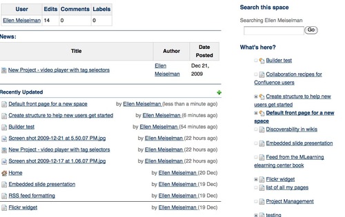
Confluence: create structure to help new wiki users get started
Once you've created a shared online space for your coworkers, you may discover with some frustration that it doesn't receive the level of interest you are hoping for. One reason for this reluctance to contribute may be lack of structure. Wikis don't make a lot of assumptions about how you want to structure or navigate through your data, and this lack of structure can be confusing and somewhat intimidating to users, particularly if they aren't sure where to put their information. This confusion is not limited to non-technical people: I've seen IT community sites and wikis lose members largely because of poor planning and navigational cues.
Although theoretically, the ability to add labels or tags to wiki pages eliminates the need to put them in any particular location within the site structure, people still like to know "where they are" within a site because the relationships between documents carries a lot of information about the significance of the document itself. Users need clues as to what else might be there and what to expect when they click to other pages.
Create windows into your content
Out of the box, wiki-based sites can present a rather "opaque" face to new users. Users can't scan a wiki the way they would flip through a magazine, so if your content is worth reading, it is worth spending some time to help them find it. Although we are all used to using searches to find content on unstructured sites like Wikipedia, you probably do not want to rely on your users having to find important content this way on your _own_ space. If you rely entirely on your users' motivation or ability to find important content by searching, chances are they will never see it.
Relying on search is not a great way to introduce information that people are not already looking for, like news or new features. This is where a combination of information architecture, careful site planning and regular review of how well the current structure is serving your community comes in. It is usually well worth the time to create "windows" down into your information by creating logical information structures, portal pages, consistent navigational aids and even by advertising significant content to your users. If you can find people who are willing to assume the roles of information architect/usability police, librarian and "PR" manager for the site, you will find their efforts are repaid quickly.
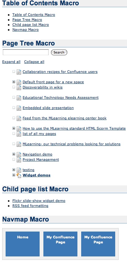
Examples of some of the built-in filters you can add to pages to help users find information: User contributions, Blog posts ("News"), Recently Updated items, and "child pages" macro. Most of these allow further filtering by type of content, labels, users or other criteria to keep the noise-level down and offer a clean display to readers.
Create logical information structures
Chances are, your wiki space has several purposes. It may be some combination of project collaboration, document management, documentation and knowledge collection. Each of these have their own structural and navigational requirements.
Documentation sites are often hierarchical in nature: they may be divided by product or application, then by the nature of the documentation - reference, training, manual, by task.
Project collaboration sites may be "flatter", without a rigidly imposed structure. Team areas, may be largely unstructured and function mainly for discussion or document sharing.
Departmental sites may be divided in functional sections such as forums, document storage, news, calendar, etc., but these designations do not give any realy hint as to what type of information is actually IN those categories. This is where social attributes come in: filtering items by overall popularity, by author and user-created tags, by what TYPES of people are reading them (what role, what unit, etc.), by what people in related roles recommend, and what ELSE are they also reading?
Blogs and News sites often offer automatically generated filters by date, tag, related information, popularity, etc. Many authors find this isn't enough and will add their own recommendations and advertising of relevant content within their own sites. The larger the site, the more important this human touch is.
Usability and information architecture have their place in any site, including wikis. Although some of this is built-in, a lot is left up to your discretion.
It isn't that easy to come up with topic sections that everyone will understand without any assistance. Users often look for information based on the task they are currently trying to accomplish, rather than from the perspective of the site designer, so it doesn't hurt to get some user input. A few minutes spent on this can save a lot of time and confusion later.
Add consistent and usable navigation
Never assume that the wiki is providing sufficient navigational aids to your users. If they will only be accessing content through search this might be true, but if you don't help them by adding appropriate navigation, chances are you are ensuring they can +only+ find information they need through search.
Choose a theme that serves your content well by adding the navigational features most relevant to your site's function. For example, Confluence has Theme Builder themes that have top-level menus and breadcrumb navigation that would work very well for departmental sites but perhaps less so for a documentation site.
For documentation sites, you may want to add left-hand navigation of the entire page tree.
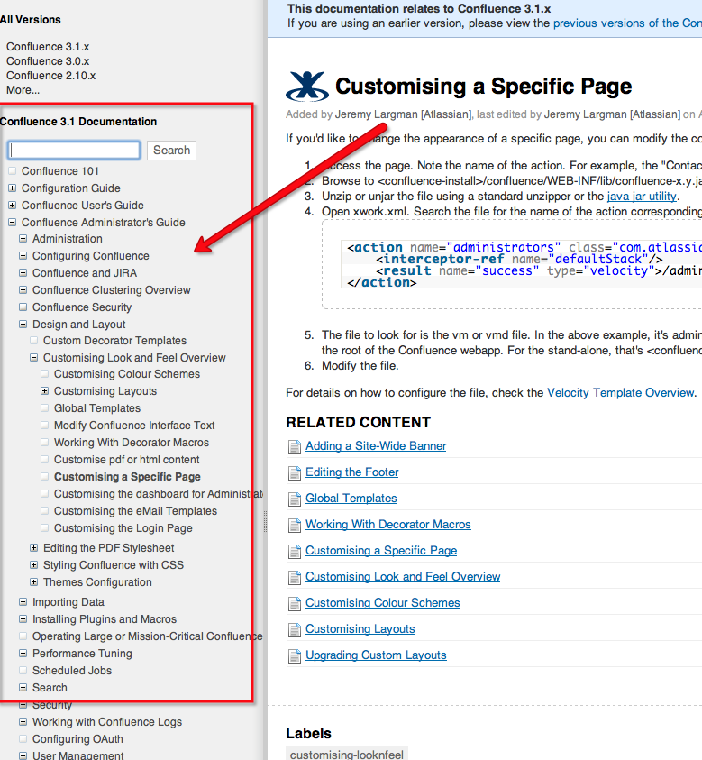
(For Confluence themes like this see: [pre-v.3.1|Adding a Navigation Sidebar] [post-v.3.1 Introducing the Confluence Documentation Theme])
----
Advertise content to your users
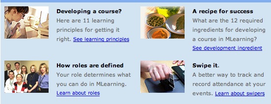
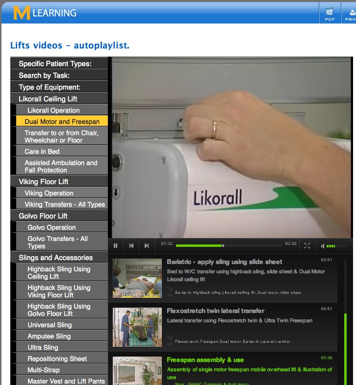
Advertising is not always a bad thing. Use ads or sidebars within your space to bring attention to content inside that may be important or helpful to the community. Create custom news feeds for logical information segments and encourage users to subscribe to them by using colorful buttons, callouts or other devices. Try to figure out why people come to specific pages by search and point them to other relevant content in a sidebar. Use pictures to pull attention toward your ads. Here's an example of a panel with brief "ads" for content buried within a site:
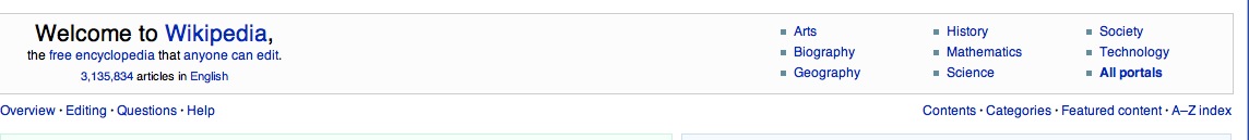
Sites like Wikipedia have invested a lot of time in creating portals and wayfinding structures to improve their browsability. Then they advertise the portals as in this banner that is currently appearing on the front page.
If the navigation provided by the theme you've chosen is not sufficient, add consistent site-wide navigation by including navigational macros in page templates, and train your users to use the templates.
The work you put in to planning and improving the site structure, usability and navigation will go a long way toward helping your users feel like they know the neighborhood. Above all, don't be afraid to change things if you see things are not working. To be successful you may have to make structural changes several time as you see that the community is moving in a different direction than you had envisioned when you first set up the site.
December 25, 2009
Copying text from a password protected PDF
I was recently sent a document in PDF format for editing and revision. Unfortunately the author had protected the document from copying, pasting, annotation, page extraction - in short everything necessary to be able to edit the document on-screen. Since I was supposed to send the edited document back to the author, I knew it was unintentional.
The revisions had to be done quickly, so I decided to see if it were possible to get around the protection without a lot of work. A quick glance around the internet showed there are many utilities for sale that remove copy protection from PDFs, but I also recalled that a while back, Apple's Preview.app used to ignore the copy protection settings. This was many versions ago, and since then it has started honoring the settings, but I hoped it might not be completely identical in its security to Acrobat.
Indeed it isn't. Opening the secure PDF in Preview, I discovered it still allows copying, pasting the text into another application, and even better, if you simply print to PDF, you can resave the file as a non-copy protected PDF:
Select File > Print, then click the PDF button in lower left corner, and select Save as PDF...
December 15, 2009
JW FLV player with Javascript playlist
This is an example of how to create a javascript-based Playlist selector for a JW FLV player. The playlist selector menu has 3 sections that toggle open and closed when you click on them. This allows the user to switch playlists, choosing from various topics.
The source code has not been cleaned up, but you should be able to get an idea of how to set this up from it.
The demo shows how the menu works, but no videos will play because the playlists currently point to an inaccessible red5 server.
[DEMO]
[ DOWNLOAD SOURCE ]
A sample playlist has been included here:
If you are going to use this with a flash streaming server (RTMP or RTMPT), ask longtail video for v.4.7beta - it has an important bugfix in it.
December 12, 2009
Kindle DX review
For several days I've already been enjoying a great pre-Christmas present: a new Kindle DX! Despite being early, it didn't come a moment too soon. For quite a while, I've been hoping for a better way to read to cope with my aging eyesight and tired eyes and the ever-increasing amount of reading on my desk. Most of my work-related reading in PDF format, and up until now, no device displayed PDF's well except a computer or laptop.
So when the Sony and Kindle ebook readers came out a few years ago, I looked at them both carefully - as much as possible considering neither is available to try out - to see if they would fit my needs. But neither device displayed PDF's well (or at all!) and the screen size of both of them was too small for my taste. I wanted to get away from the tiny paperback book format, yet without the weight of a hardcover book.
When the Kindle DX came out this year, I waited for several months to see if anyone would come out with a competitor by Christmas, and finally gave in, when the only competing product to appear was the Nook. The price of the DX is too high by several hundred dollars, but it is cheaper than new eyes.
So, I asked for one for Christmas.
Here are my impressions of the Kindle DX so far.
Size and weight
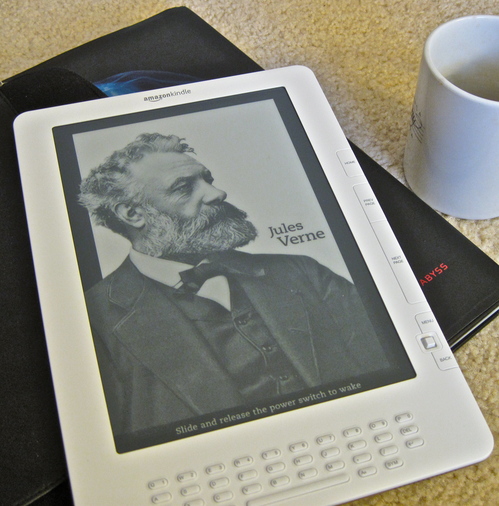
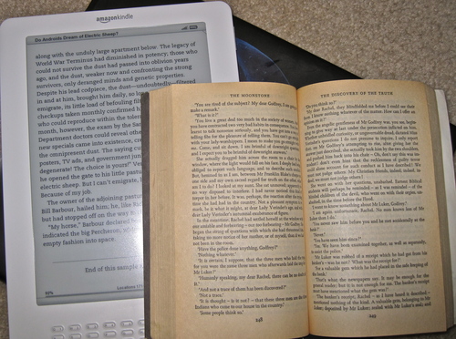
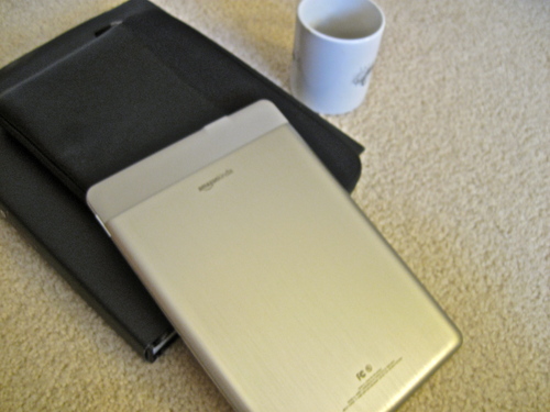
Since you cannot see a Kindle in person without ordering one, you have to depend on the ads to visualize its ergonomic characteristics. I found it difficult to get an idea of the size and feel of it from Amazon's ads. I thought it looked kind of weird - that turns out to be less so up close. In the following two images I've attempted to put the Kindle DX into scale for you with common objects. [Click the images for an enlarged view.]
Here it is next to a coffee mug (The Jules Verne picture is part of a screensaver, by the way)
...and next to a standard paperback book.
Nor do Amazon's ads convey how thin it is - it's very thin and light! I'd say it weighs about the same as an empty ceramic coffee mug. Much MUCH lighter than a netbook or notebook computer.
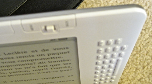
The back is a rounded brushed-aluminum somewhat reminiscent of my first-gen iPhone, but much larger.
Readability: Books
Reading books on the Kindle is a pleasure, as long as there is enough light. Because it is an electronic device I do find myself looking for the brightness adjustment sometimes but it's no worse than a book when there is a light. Where the Kindle outshines a book is when I enlarge the text. Text can be enlarged to 5 sizes. The biggest looks to be about 18 or 20 px, and the font is quite readable. The Kindle will also read to you in various speeds and in male or female voice. The male voice at normal speed is astonishingly life-like, but the other speeds and settings are more traditionally robotic. Illustrations are less successful. Although the grayscale provides plenty of detail, Illustrations do not smoothly zoom to whatever size is necessary to view them comfortably. They size to the smallest dimension, depending on your orientation. So in the case of full page illustrations in a book I am reading, the illustration cannot be viewed at a usable size. There is no resizing or zoom function for illustrations.
Readability: PDFs
Unlike native Kindle format and text format books, PDFs can not be resized in increments. They do not reflow, and appear in their original format. This is usually a good thing, since the format is often crucial to comprehending what is going on in a complex layout, but not so good if the text is too small. PDFs do enlarge to fit the width of the
screen, so they come in two sizes depending on the orientation of the Kindle. If the PDF is
set in two columns, the text may be too small to read in vertical mode, but horizontal mode is usually large enough. Since an update last night, it does try to crop out excess whitespace to maximize the size. Additional zoom sizes would be nice though.
Navigation
The Kindle thinks in terms of discrete pages, NOT in terms of
continuous scrolling. We are so used to scrolling or panning around in
a document, this can take a little getting used to, particularly in
PDFs or in the web browser. The Previous and Next buttons replace scrolling for most purposes. Of course, it is not easy to skim through a book using the Previous and Next buttons - the e-ink screen refresh is too slow.
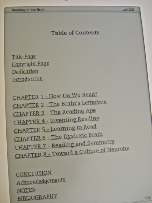
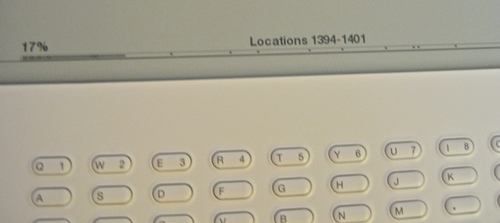
Instead, I find myself using the clickable table of contents if there is one, or the location numbers, if not. Location numbers are like page numbers that remain attached to specific sections of the document even when the text size changes. Kindle books always have a clickable table of contents, but books in other formats may not. A Kindle book table of contents is shown below.
Books downloaded from Gutenberg in text format have to be navigated through in other ways. PDFs also lose their bookmarking features, as far as I can tell. Scrolling quickly through a PDF is not possible - the previous and next buttons or page numbers must be used to navigate.
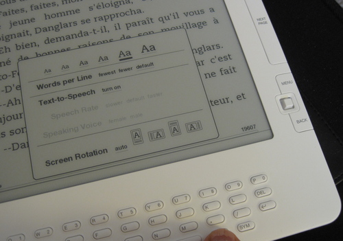
Many of the navigation functions for all formats are accessed from the "Menu" button. From within a book, this menu allows access to the Table of Contents and to the Go to Location function which allows you to specify digital "page numbers" to jump to.
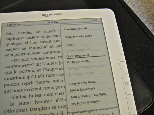
This Go to Location function could definitely use some work. When selected, a Go To box comes up at the bottom of the screen, so you can enter a location number. The problem is that you must hit the "alt" key before each digit, and there can be 4-5 digits in the location numbers in a modest-sized book. It's kludgy and slow to enter them and not terribly intuitive to figure out what number is close to where you want to go. It would be much easier to simply use the 5-way controller to move back and forth across the progress bar. Even better would be if while you were scanning across the bar, a few words from the top of the page or the title of the chapter would show up.
Typing on the Kindle: two thumbs DOWN
And that brings me to the topic of the keyboard. I'm not sure how they decided to go with a keyboard that is so hard to press the buttons on, but perhaps it was a compromise necessary to keep the buttons from being accidentally pressed too often. In any case it needs to be rethought. It makes it nearly useless. I can't imagine using it to type lengthy notes and annotations in books. Far easier to write in the margin of a traditional book, or on a post-it note.
Indexes - uh oh!
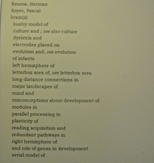
I recently read a review of either the Kindle or the Nook - I forget which - which complained that books lost their human-created index. This is true in that although there is an index, it is not clickable. In other words it is not usable! The conversion to Kindle format does not associate the index terms with corresponding location numbers. I would imagine this would be a deal-breaker for many students and scholars.
Shown below is a sample index from the book Reading in the Brain by Stanislas Dehaene.
Adding personal files and PDFs to the Kindle
I've tried both using Amazon's email-files-to-Kindle and USB to transfer files. Both work well, but you are charged 15 cents to email a file direct to the Kindle. PDFs can be transferred by email without converting to Kindle format or, if you type "convert" in the subject line they will be converted. If you want files converted, but don't want to pay the 3G transfer fee, email the PDFs to amazon, they will be converted, then you can download them to the Kindle for free. Otherwise, the Kindle mounts to the desktop like any other removable storage device for file transfer.
Here's are the file formats that can be e-mailed to and viewed on Kindle:
Microsoft Word (.DOC)
HTML (.HTML, .HTM)
RTF (.RTF)
JPEG (.JPEG, .JPG)
GIF (.GIF)
PNG (.PNG)
BMP (.BMP)
PDF (.PDF)
Microsoft Word (.DOCX) [experimental]
These file types can also be combined in a compressed ZIP (.ZIP)
file.
Web
The best I can say for the web browser included with the Kindle is that it is there, and reminds me greatly of browsing on my old Blackberry. It really is mostly for text. Styles and illustrations are pretty much ignored. On the other hand it is handy for searching Google, Wikipedia and other services.
December 9, 2009
jQuery UI Accordion does not function in IE7/WinXP
The Accordion is one of the handy interface widgets that can be generated using jQuery UI. There are several optional settings you can add into the function call, including animation, auto-height, etc. If you find it is not working on IE7try adding "animated:false" as one of the options.
If you are running a debugger on IE, and see the error "invalid option on line 486" this is definitely the problem.
Working code example:
<script type="text/javascript">

	$(function() {

		$("#accordion").accordion({ header: "h3",autoHeight:false,animated: false});

	});

	</script>
December 1, 2009
Folic acid supplements in late pregnancy increase risk of asthma
According to CDC statistics, U.S. childhood asthma prevalence more than doubled between 1980 to the mid-1990s and has since plateaued at those historically high levels. Although many triggers and risk factors for asthma have been identified, the reasons behind this increase are not yet understood.
A recent study by University of Adelaide researchers Whitrow, Moore, Rumbold, and Davies may shed some light on the rise in asthma in young children. The study appears to show that the use of folic acid supplements in late pregnancy can lead to increased allergic asthma in children of 3.5 years of age. This human study corroborates earlier studies in mice which indicated that supplementation with folate in pregnancy leads to an allergic asthma phenotype in mice via epigenetic mechanisms (changes in gene expression).
Folic acid supplements taken in pre- or early pregnancy were not associated with asthma at any age (except as noted below). Dietary folate (from foods and vegetables, not supplements) was not associated with asthma in either age group at any stage of pregnancy.
For folate supplementation in early pregnancy, there was a decrease in the relative risk of asthma at 3.5 years of 43% for every 100-µg increase in dietary folate taken in early pregnancy if the mother had asthma herself.
For child asthma at 5.5 years, they found that for every 100-lg unit increase in dietary folate in early pregnancy, the relative risk of the child's having asthma at 5.5 years increased by 77% if the mother smoked during early pregnancy
For every 1,000-lg increase in folic acid in late pregnancy, the relative risk
of the child's having asthma at 5.5 years more than doubled if the mother had a previous child.
For every 1,000-lg increase in folic acid in late pregnancy, the relative risk of the child's having asthma at 5.5 years decreased by 37% if the mother had asthma.
The authors speculate that there is a potentially important critical period of pregnancy during which supplement dosages may be manipulated to optimize the neuroprotective effects of supplemental folic acid without increasing the risk of asthma, and suggest that these results also provide testable theories to explain the rise in asthma prevalence noted internationally.
The study was conducted over 5.5 years with mothers that were recruited in the first 16 weeks of pregnancy between 1998 and 2000, prior to the introduction of folic acid fortified foods in Australia.