Once you've created a shared online space for your coworkers, you may discover with some frustration that it doesn't receive the level of interest you are hoping for. One reason for this reluctance to contribute may be lack of structure. Wikis don't make a lot of assumptions about how you want to structure or navigate through your data, and this lack of structure can be confusing and somewhat intimidating to users, particularly if they aren't sure where to put their information. This confusion is not limited to non-technical people: I've seen IT community sites and wikis lose members largely because of poor planning and navigational cues.
Although theoretically, the ability to add labels or tags to wiki pages eliminates the need to put them in any particular location within the site structure, people still like to know "where they are" within a site because the relationships between documents carries a lot of information about the significance of the document itself. Users need clues as to what else might be there and what to expect when they click to other pages.
Ads by Google
Posted by ellen at December 27, 2009 12:22 PM
Create windows into your content
Out of the box, wiki-based sites can present a rather "opaque" face to new users. Users can't scan a wiki the way they would flip through a magazine, so if your content is worth reading, it is worth spending some time to help them find it. Although we are all used to using searches to find content on unstructured sites like Wikipedia, you probably do not want to rely on your users having to find important content this way on your _own_ space. If you rely entirely on your users' motivation or ability to find important content by searching, chances are they will never see it.
Relying on search is not a great way to introduce information that people are not already looking for, like news or new features. This is where a combination of information architecture, careful site planning and regular review of how well the current structure is serving your community comes in. It is usually well worth the time to create "windows" down into your information by creating logical information structures, portal pages, consistent navigational aids and even by advertising significant content to your users. If you can find people who are willing to assume the roles of information architect/usability police, librarian and "PR" manager for the site, you will find their efforts are repaid quickly.
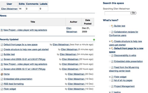
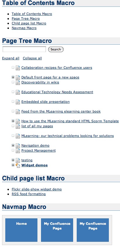
Examples of some of the built-in filters you can add to pages to help users find information: User contributions, Blog posts ("News"), Recently Updated items, and "child pages" macro. Most of these allow further filtering by type of content, labels, users or other criteria to keep the noise-level down and offer a clean display to readers.
Create logical information structures
Chances are, your wiki space has several purposes. It may be some combination of project collaboration, document management, documentation and knowledge collection. Each of these have their own structural and navigational requirements.
Documentation sites are often hierarchical in nature: they may be divided by product or application, then by the nature of the documentation - reference, training, manual, by task.
Project collaboration sites may be "flatter", without a rigidly imposed structure. Team areas, may be largely unstructured and function mainly for discussion or document sharing.
Departmental sites may be divided in functional sections such as forums, document storage, news, calendar, etc., but these designations do not give any realy hint as to what type of information is actually IN those categories. This is where social attributes come in: filtering items by overall popularity, by author and user-created tags, by what TYPES of people are reading them (what role, what unit, etc.), by what people in related roles recommend, and what ELSE are they also reading?
Blogs and News sites often offer automatically generated filters by date, tag, related information, popularity, etc. Many authors find this isn't enough and will add their own recommendations and advertising of relevant content within their own sites. The larger the site, the more important this human touch is.
Usability and information architecture have their place in any site, including wikis. Although some of this is built-in, a lot is left up to your discretion.
It isn't that easy to come up with topic sections that everyone will understand without any assistance. Users often look for information based on the task they are currently trying to accomplish, rather than from the perspective of the site designer, so it doesn't hurt to get some user input. A few minutes spent on this can save a lot of time and confusion later.
Add consistent and usable navigation
Never assume that the wiki is providing sufficient navigational aids to your users. If they will only be accessing content through search this might be true, but if you don't help them by adding appropriate navigation, chances are you are ensuring they can +only+ find information they need through search.
Choose a theme that serves your content well by adding the navigational features most relevant to your site's function. For example, Confluence has Theme Builder themes that have top-level menus and breadcrumb navigation that would work very well for departmental sites but perhaps less so for a documentation site.
For documentation sites, you may want to add left-hand navigation of the entire page tree.
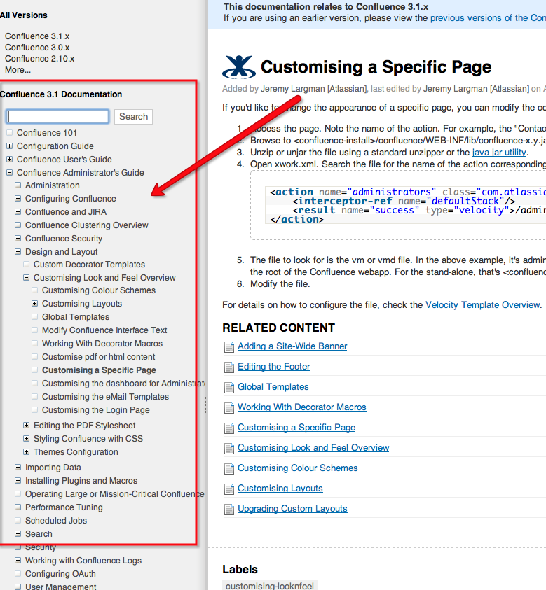
(For Confluence themes like this see: [pre-v.3.1|Adding a Navigation Sidebar] [post-v.3.1 Introducing the Confluence Documentation Theme])
----
Advertise content to your users
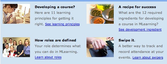
Advertising is not always a bad thing. Use ads or sidebars within your space to bring attention to content inside that may be important or helpful to the community. Create custom news feeds for logical information segments and encourage users to subscribe to them by using colorful buttons, callouts or other devices. Try to figure out why people come to specific pages by search and point them to other relevant content in a sidebar. Use pictures to pull attention toward your ads. Here's an example of a panel with brief "ads" for content buried within a site:
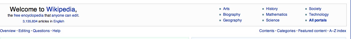
Sites like Wikipedia have invested a lot of time in creating portals and wayfinding structures to improve their browsability. Then they advertise the portals as in this banner that is currently appearing on the front page.
If the navigation provided by the theme you've chosen is not sufficient, add consistent site-wide navigation by including navigational macros in page templates, and train your users to use the templates.
The work you put in to planning and improving the site structure, usability and navigation will go a long way toward helping your users feel like they know the neighborhood. Above all, don't be afraid to change things if you see things are not working. To be successful you may have to make structural changes several time as you see that the community is moving in a different direction than you had envisioned when you first set up the site.
Ads by Google
