For several days I've already been enjoying a great pre-Christmas present: a new Kindle DX! Despite being early, it didn't come a moment too soon. For quite a while, I've been hoping for a better way to read to cope with my aging eyesight and tired eyes and the ever-increasing amount of reading on my desk. Most of my work-related reading in PDF format, and up until now, no device displayed PDF's well except a computer or laptop.
Ads by Google
Posted by ellen at December 12, 2009 09:12 AM
So when the Sony and Kindle ebook readers came out a few years ago, I looked at them both carefully - as much as possible considering neither is available to try out - to see if they would fit my needs. But neither device displayed PDF's well (or at all!) and the screen size of both of them was too small for my taste. I wanted to get away from the tiny paperback book format, yet without the weight of a hardcover book.
When the Kindle DX came out this year, I waited for several months to see if anyone would come out with a competitor by Christmas, and finally gave in, when the only competing product to appear was the Nook. The price of the DX is too high by several hundred dollars, but it is cheaper than new eyes.
So, I asked for one for Christmas.
Here are my impressions of the Kindle DX so far.
Size and weight
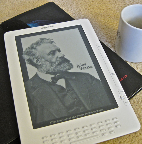
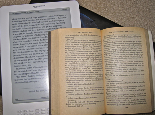
Since you cannot see a Kindle in person without ordering one, you have to depend on the ads to visualize its ergonomic characteristics. I found it difficult to get an idea of the size and feel of it from Amazon's ads. I thought it looked kind of weird - that turns out to be less so up close. In the following two images I've attempted to put the Kindle DX into scale for you with common objects. [Click the images for an enlarged view.]
Here it is next to a coffee mug (The Jules Verne picture is part of a screensaver, by the way)
...and next to a standard paperback book.
Nor do Amazon's ads convey how thin it is - it's very thin and light! I'd say it weighs about the same as an empty ceramic coffee mug. Much MUCH lighter than a netbook or notebook computer.
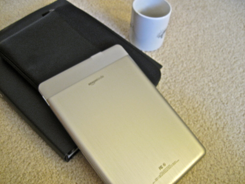
The back is a rounded brushed-aluminum somewhat reminiscent of my first-gen iPhone, but much larger.
Readability: Books
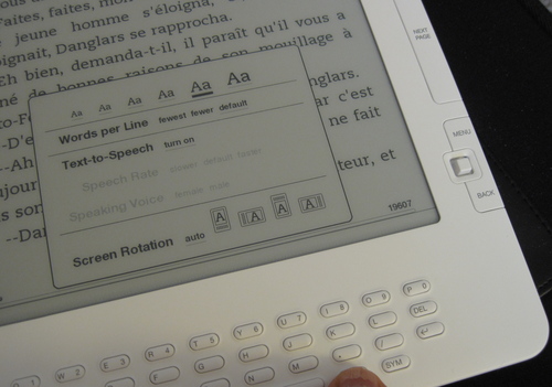
Reading books on the Kindle is a pleasure, as long as there is enough light. Because it is an electronic device I do find myself looking for the brightness adjustment sometimes but it's no worse than a book when there is a light. Where the Kindle outshines a book is when I enlarge the text. Text can be enlarged to 5 sizes. The biggest looks to be about 18 or 20 px, and the font is quite readable. The Kindle will also read to you in various speeds and in male or female voice. The male voice at normal speed is astonishingly life-like, but the other speeds and settings are more traditionally robotic. Illustrations are less successful. Although the grayscale provides plenty of detail, Illustrations do not smoothly zoom to whatever size is necessary to view them comfortably. They size to the smallest dimension, depending on your orientation. So in the case of full page illustrations in a book I am reading, the illustration cannot be viewed at a usable size. There is no resizing or zoom function for illustrations.
Readability: PDFs
Unlike native Kindle format and text format books, PDFs can not be resized in increments. They do not reflow, and appear in their original format. This is usually a good thing, since the format is often crucial to comprehending what is going on in a complex layout, but not so good if the text is too small. PDFs do enlarge to fit the width of the
screen, so they come in two sizes depending on the orientation of the Kindle. If the PDF is
set in two columns, the text may be too small to read in vertical mode, but horizontal mode is usually large enough. Since an update last night, it does try to crop out excess whitespace to maximize the size. Additional zoom sizes would be nice though.
Navigation
The Kindle thinks in terms of discrete pages, NOT in terms of
continuous scrolling. We are so used to scrolling or panning around in
a document, this can take a little getting used to, particularly in
PDFs or in the web browser. The Previous and Next buttons replace scrolling for most purposes. Of course, it is not easy to skim through a book using the Previous and Next buttons - the e-ink screen refresh is too slow.
Instead, I find myself using the clickable table of contents if there is one, or the location numbers, if not. Location numbers are like page numbers that remain attached to specific sections of the document even when the text size changes. Kindle books always have a clickable table of contents, but books in other formats may not. A Kindle book table of contents is shown below.
Books downloaded from Gutenberg in text format have to be navigated through in other ways. PDFs also lose their bookmarking features, as far as I can tell. Scrolling quickly through a PDF is not possible - the previous and next buttons or page numbers must be used to navigate.
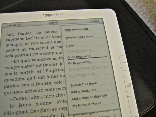
Many of the navigation functions for all formats are accessed from the "Menu" button. From within a book, this menu allows access to the Table of Contents and to the Go to Location function which allows you to specify digital "page numbers" to jump to.
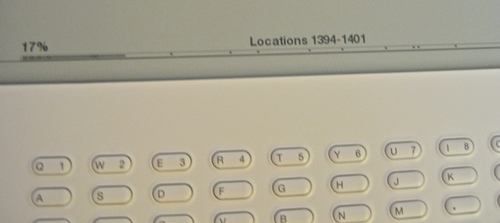
This Go to Location function could definitely use some work. When selected, a Go To box comes up at the bottom of the screen, so you can enter a location number. The problem is that you must hit the "alt" key before each digit, and there can be 4-5 digits in the location numbers in a modest-sized book. It's kludgy and slow to enter them and not terribly intuitive to figure out what number is close to where you want to go. It would be much easier to simply use the 5-way controller to move back and forth across the progress bar. Even better would be if while you were scanning across the bar, a few words from the top of the page or the title of the chapter would show up.
Typing on the Kindle: two thumbs DOWN
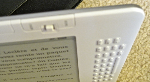
And that brings me to the topic of the keyboard. I'm not sure how they decided to go with a keyboard that is so hard to press the buttons on, but perhaps it was a compromise necessary to keep the buttons from being accidentally pressed too often. In any case it needs to be rethought. It makes it nearly useless. I can't imagine using it to type lengthy notes and annotations in books. Far easier to write in the margin of a traditional book, or on a post-it note.
Indexes - uh oh!
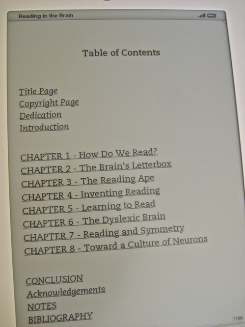
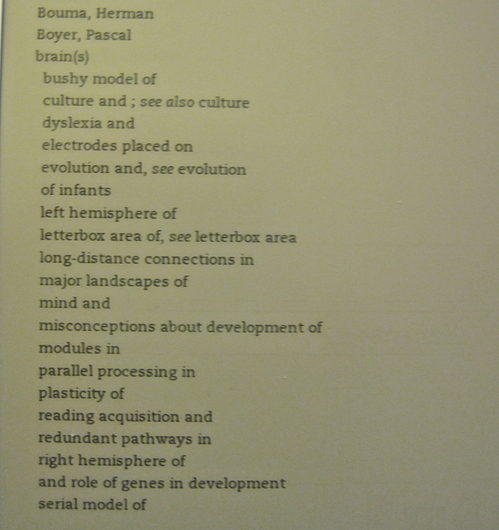
I recently read a review of either the Kindle or the Nook - I forget which - which complained that books lost their human-created index. This is true in that although there is an index, it is not clickable. In other words it is not usable! The conversion to Kindle format does not associate the index terms with corresponding location numbers. I would imagine this would be a deal-breaker for many students and scholars.
Shown below is a sample index from the book Reading in the Brain by Stanislas Dehaene.
Adding personal files and PDFs to the Kindle
I've tried both using Amazon's email-files-to-Kindle and USB to transfer files. Both work well, but you are charged 15 cents to email a file direct to the Kindle. PDFs can be transferred by email without converting to Kindle format or, if you type "convert" in the subject line they will be converted. If you want files converted, but don't want to pay the 3G transfer fee, email the PDFs to amazon, they will be converted, then you can download them to the Kindle for free. Otherwise, the Kindle mounts to the desktop like any other removable storage device for file transfer.
Here's are the file formats that can be e-mailed to and viewed on Kindle:
Microsoft Word (.DOC)
HTML (.HTML, .HTM)
RTF (.RTF)
JPEG (.JPEG, .JPG)
GIF (.GIF)
PNG (.PNG)
BMP (.BMP)
PDF (.PDF)
Microsoft Word (.DOCX) [experimental]
These file types can also be combined in a compressed ZIP (.ZIP)
file.
Web
The best I can say for the web browser included with the Kindle is that it is there, and reminds me greatly of browsing on my old Blackberry. It really is mostly for text. Styles and illustrations are pretty much ignored. On the other hand it is handy for searching Google, Wikipedia and other services.
Ads by Google
Thanks for the review! I concur with most of your assessments (but for the Kindle 2)...not sure that the improvements made for the DX warrant an upgrade. (The improvements I most wanted are not included.)
One of the strangest experiences I have had is that my Kindle is in a cover and occasionally I find myself attempting to turn the page. :) An indicator that - while not that same experience as holding a book - I have more of a book reading sense than I ever have had with a computer.
Is there a light installed in the device? I received one for the holidays and I am having difficulty reading without a light but I do not know if one is installed.
No, there is no backlight. It's like a book: you need a light to read by.
One of the reasons I love my Kindle is that it has helped me improve a lot on my efficiency and utilize my time. Before I have the Kindle, waiting time like when I'm waiting for friends or waiting for shuttle bus or some thing like that is simply wasted. Now I just need to bring the Kindle 2 along with me, and all my favorite books are inside it. Another thing I like the most is the text-to-speech function, which means I can "read" books without even holding or looking at the Kindle. Now I like to use this function when I've myself busy on some boring things, say when I'm on the step machine or doing some housework...
Good read. You ok if i add this info to my blog ?
Lack of human-created indexes is one of the reasons that I am putting up indexes on www.indexmasher.com for readers to download for free. I currently have indexes to books from Seth Godin but are taking suggestions on others. Also, they contain actual page numbers, but we might do Location numbers soon (although I believe the newest generation Kindles have page numbers that correspond to the print edition's pages).