A colleague at work needed to know how to turn on captions in Windows Media Player. I started to write her a note explaining it, but needed to check exactly how to get to the setting since I knew how to do it in older versions but not 11.
This turned out to be just another opportunity to experience Microsoft's creative approach to usability.
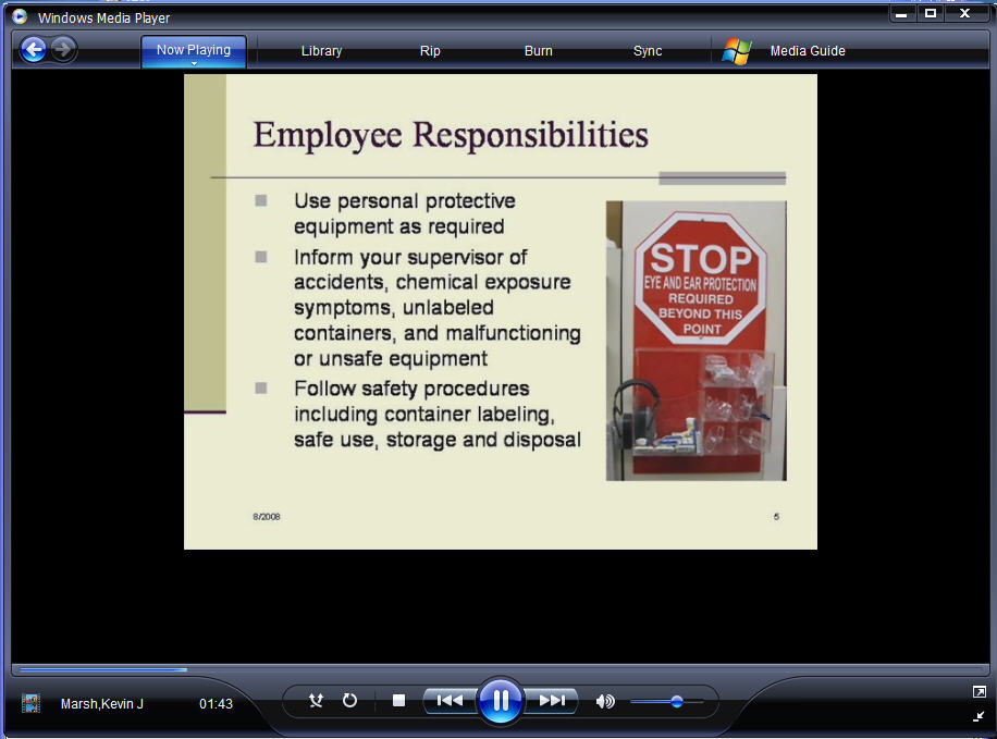
Here's a snapshot of the the player. Note, there is no "File" menu, no Open command, nothing that appears useful unless you are purchasing music from their store or ripping from an old CD. And really, aren't "Rip" and "Burn" SO 2006? Who even cares about ripping CD's anymore?
Ads by Google
Posted by ellen at December 23, 2008 04:03 PM
But I digress. The file I wanted to play is an ASX file on the web which contains a reference to her video and her SAMI caption file. As I said, there is no "Open" command visible in the interface, so I gave up on opening the file from within the player and right-clicked the ASX file on my desktop, then selected "Open with..." > "Windows Media Player."
I knew from experience I needed to find a setting "Show Captions." That setting used to be pretty easy to locate, but not anymore. After some fruitless attempts to find any menu option that looked like it might be related to captions, including a brief trip to one dialog with 10 inscrutable tabs in it, I opened the Help file, and searched for "Captions". This brought up many choices, including "Showing or Hiding". Wonderful!
But Not So Fast! The help file says that Step 1. is "Click the PLAY menu...etc." But, there IS NO PLAY menu, as I think I mentioned!
I started right clicking everything visible, and accidentally happened on the correct spot - it is a tiny target, indeed: the title bar of the window. This brought up a drop-down menu listing File, View, Play, and other crucial items including "Show Classic Menus." I guess they are called "Classic" because you are no longer supposed to need them. I mean, who would want to Open a file? Or perhaps you are supposed to get used to using right-click for everything?
This setup reminds me of what they used to call "mystery-meat" navigation, where a site's navigation buttons were so cryptic that you couldn't tell what their destinations were without mousing over each one. Microsoft, HELLO! Do not assume we don't need the File menu!!! Replace those out of date Rip and Burn buttons on your slick interface with menus showing File, View, Play, etc.
Of course, once I selected Show "Classic" Menus, all was well again.
Ads by Google


