1. Navigation should be visible most of the time. The first time I looked through a book created with the Drupal's book module, I recall being confused about how to proceed through the document. My confusion resulted from starting on a long page, so that the "previous/up/next" navigation had fallen below the "fold." Since I was new to Drupal-based books, I wasn't even aware it was there.
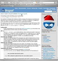
A long page where navigation has dropped below the fold.
The only other visible navigation which was relevant to the book was the breadcrumb trail at the top of the page, which allows the reader to jump "up" a level but not backwards and forwards between pages of a chapter.
I did figure the system out within a few minutes, but I've watched others who are less interested in "figuring things out" attempt fruitlessly to find their way around such issues, and pretty much give up. It is amazing how people don't think to look around the page, or having looked, misunderstand what they are seeing.
Ads by Google
Posted by ellen at January 11, 2004 10:24 PM
Sometimes I watch my users miss what I think is obvious, and all I can think of is "it's RIGHT THERE IN FRONT OF YOU!!!" but that is not a very useful attitude.
Many of the users I create sites for would get very frustrated with seeing no navigation immediately and would probably assume there was no way to get around in the book.
An easy way to fix this problem might be to duplicate the navigation at the top of the article also. I imagine this could be done with a little modification to the theme, or to the book module, calling the "Previous/Top/Next" navigation area twice. In my own experience I've found that users really do use that top navigation a lot. Lots of times people don't read to the bottom - they look at a page to see if there is anything of interest, then go to the next page.
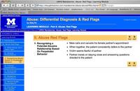
To illustrate some of my suggestions, I'm using a non-Drupal learning module I'm working on at the moment.
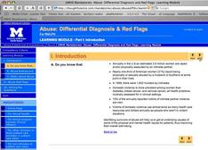 | 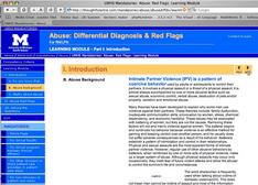 |
| Both top and bottom navigation arrows show up on short pages | Only the top ones show up on long pages, the bottom ones drop below fold. |
2. It should be clear where you are in the document at all times.
The current Drupal book module does a nice job of making a clickable outline of the entire book on the parent page of the book and an outline for each section or chapter on the parent page of that chapter. However when you are not on a parent page, no outline of the book is visible, nor is it clear how to find one.
I would like to see some kind of outline-style list generated for the whole book, which would appear in the main navigation column (on the X-template theme, it's the blue column on right or left.) There should also be some kind of indication of which page in the list you are on.
When a book is open, the book navigation should push all other navigation down and out of the way, or it should collapse to the minimum necessary. I would also add an "Exit from Book" link (probably just labeled "Exit" or "Back") somewhere on the page, which would kick you back to either a list of books or a sortable list of nodes (with nodes that are pages of books NOT showing separately!! - had to get my pet peeve in there, sorry!).
Menu items should not simply duplicate the title of a page. When creating a book page, there should be an option to enter a shorter phrase that would show up as the outline link for that page. So, if a theme took the navigation list and turned it into buttons, you could have an abbreviated title on each button and a much longer title on the actual page.
3. Reduce the number of elements on the page to what people really need
I've been searching for good models to use for ebook layout. There don't seem to be too many. Adobe Acrobat, in my opinion, is a good example of what not to do: leaving aside the time it takes to start up, an acrobat page is confusing. The toolbar has too many items on it, and surprisingly, it is not at all obvious to people what to do with the thumbnails/bookmarks, etc on the left. I use Acrobat at work, but it is the result of winnowing down bad solutions to the least bad, not preference. Drupal has a whopping advantage over Acrobat right off the bat, since it spits out good old html - add to that some usability, and you have a winner.
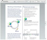
Macromedia FlashPaper
Macromedia's FlashPaper is an interesting solution, although I am not sure I like the idea of using Flash for something like an ebook. However, I definitely like the interface, at least as far as it goes. It's clear they held a lot of meetings for the purpose of eliminating buttons - there are so few you can try them all out in about 1 minute. It is a little ironic that they obviously have adopted the philosophy that people should be able to adjust the size of the content easily, yet the interface elements are so small, and fixed. Personally, I'd make some of the buttons easier to hit, but that's an individual thing - the selection and layout of buttons is good.
There is apparently no document outline navigation or table of contents yet - but I imagine they will remedy that somehow soon. What they have shown here would be OK for short documents, less so for long structured ones.
Texterity has an interesting solution, and one that might be applicable to Drupal. Their product is .asp and javascript based, and as a result loads quickly and seems to work in all browsers. They use a collapsing tree menu on the left, and keep all side to side navigation at the top.
4. Book pages should NOT act as separate nodes, once they are incorporated in a book.
This is squarely off the navigation topic, but I had to repeat this from last time.
Clicking on a taxonomy link results in a list of nodes in that taxonomy. So far so good. Clicking on the TITLE PAGE node for the book results in seeing ONLY THE node itself, completely out of the book context. It doesn't bring the book along with it. No way to get to the rest of the book, and no way to tell that it actaully IS part of a book.
Clicking the title link does the same thing. You end up on the node itself, minus the book navigation. It's as if the node has gone off on it's own little cowboy mission, leaving the book behind. This is OK for some programmer/administrators who like to think of everything as the molecular node, but highly confusing for your readers.
|
| Clicking a taxo-link results in... |
 |
| This. Clicking the title of the node results in... |
| This. |
Note: the main discussion regarding these suggestions is located HERE
Ads by Google
