I've been experimenting with enhancing some of my photos in Photoshop to create more interesting images. I use a Canon PowerShot SD 990IS point-and-shoot camera that does a good job on the whole, but because the lens isn't very high quality, images sometimes come out somewhat hazy. The camera actually captures a lot of detail but it takes some processing to bring it out. I'm not against using some tricks to emphasize what's good about the picture, even to the point where it crosses the line into illustration.
For this project, I started with a fairly unexciting picture of my dining room. Its one strong point was the sunlight streaming in the windows which brought out the colors in the wood chair and tablecloth. This picture was one of several shots of the same scene with different exposure settings.
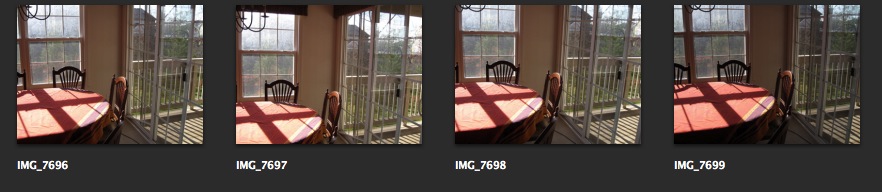
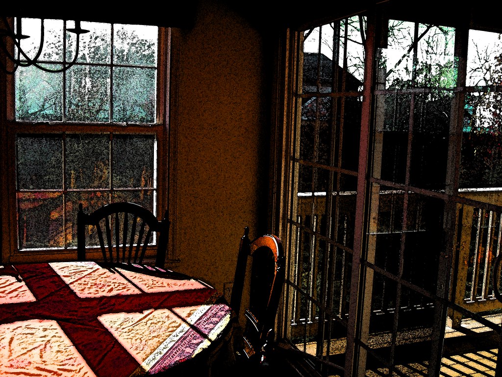
This was the lightest one, chosen for the detail visible through the windows. However in choosing the lightest exposure, the tablecloth lost a lot of its color. However I thought it had potential.
Original image

Ads by Google
Posted by ellen at November 22, 2009 05:45 PM
The finished picture
I always begin by duplicating the original Background image layer (cmd-J) so the original stays completely untouched.
Nondestructive editing is usually preferable since it retains settings and makes it possible to change your mind after closing the file, so I converted the new layer for smart filters.
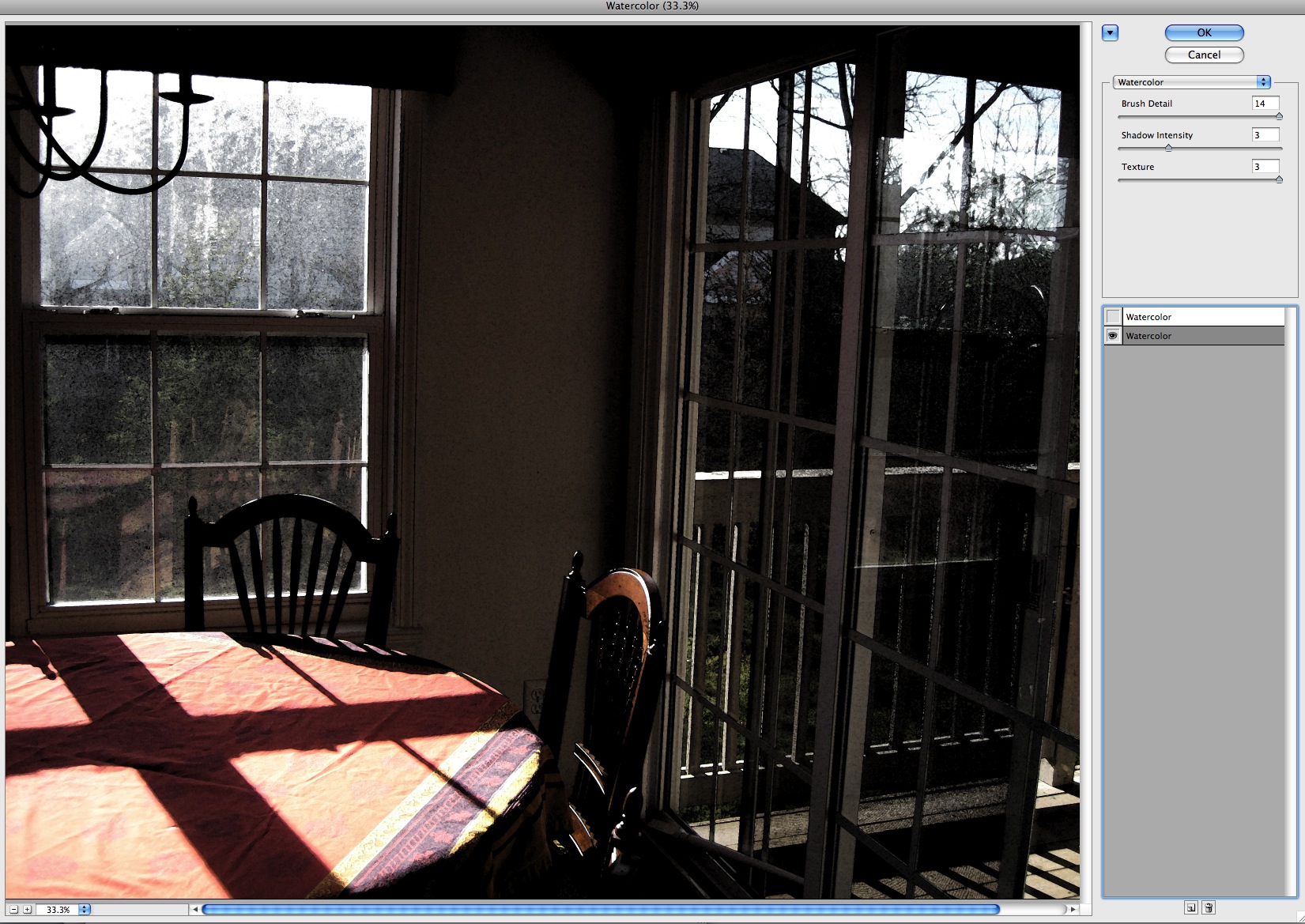
The picture needed more contrast, saturation and generally speaking, more visual energy. So, I turned to some of the built-in filters in the Filter Gallery.
The watercolor filter does a nice job of maintaining the color and structure of the image but it adds a little bleed through around the edges of every shape and a bit of texture where the "daubs" of paint intersect and overlap. I often use multiple filters, and sometimes double them up on themselves to accentuate an effect. In this case using the watercolor filter on itself added some additional texture and a sort of reticulation pattern to otherwise plain areas.
Here is the image with the first watercolor filter applied.
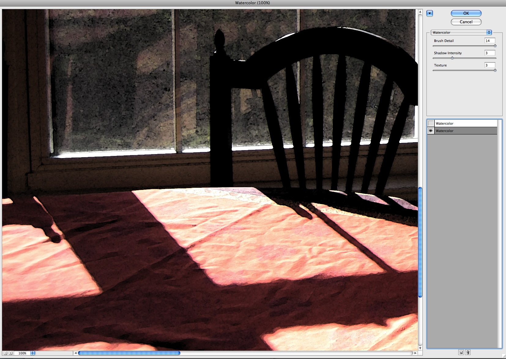
This enlargement of the tablecloth area shows the effect on the wrinkles in the tablecloth using the single watercolor filter layer. This first watercolor filter uses these settings:
- Brush Detail - 14
- Shadow Intensity - 3
- Texture - 3
Adding a second watercolor layer on top of itself emphasizes the edges of the shadows on the tablecloth as shown below. The settings for this layer are
- Brush Detail - 1
- Shadow Intensity - 0
- Texture - 2
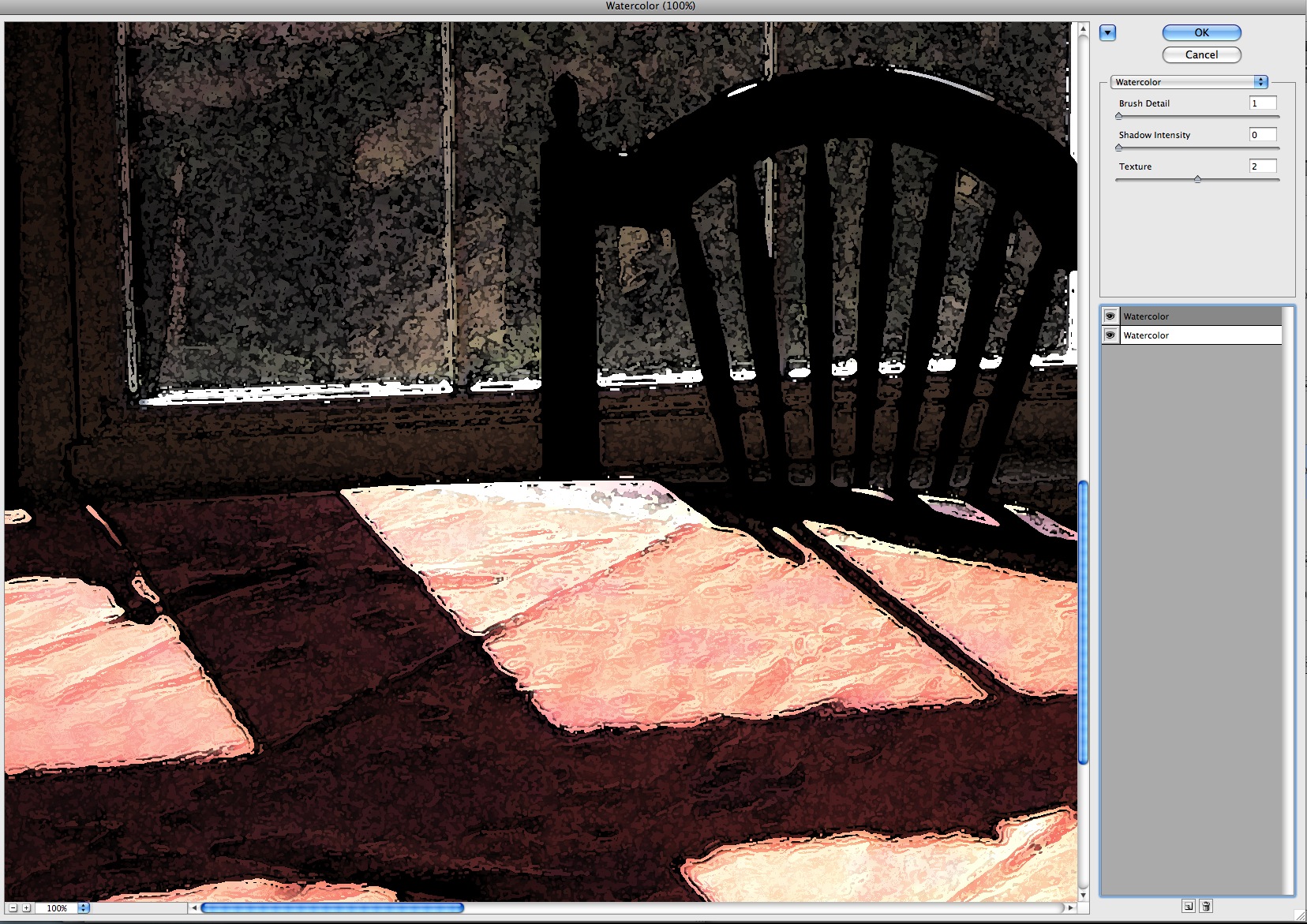
As each of these two alterations is applied, to my mind it makes the scene a little less "specific" to a time and place, and a little more timeless. Arbitrary detail is removed and what is left is the color, composition and interesting texture is added.
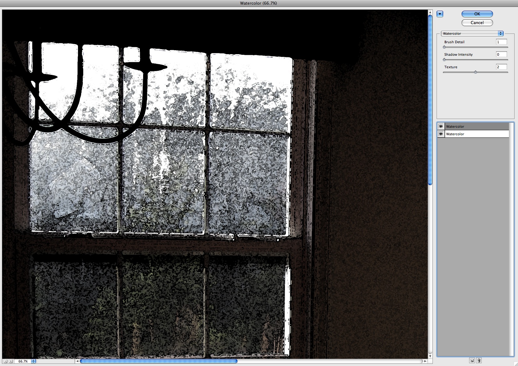
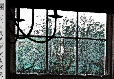
Another detail of the shot shows the change in the texture of the window area as successive filters are applied. The first filter greatly increases the contrast between the inside wall and the outside view through the window, but leaves the view through the window an even gray tone.
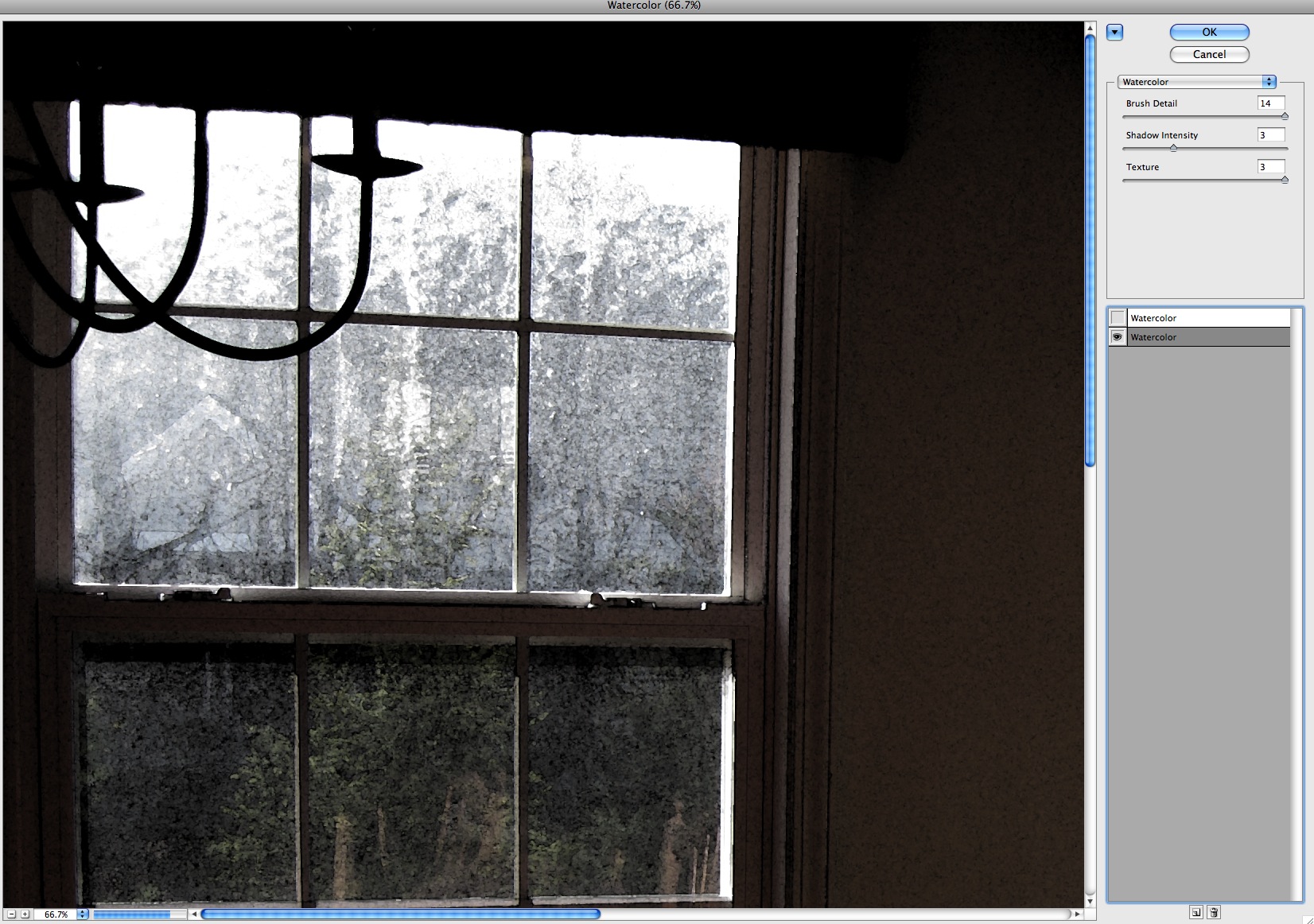
Applying the second filter adds some textural activity to the window scene and helps separate the bushes in front from the trees behind.
Here is the entire image with both watercolor filters applied. There are still big open areas in the tablecloth, and very little color in the image except in the tablecloth. But their is now also an interesting focal point where the light hits the top of the chair in the foreground.
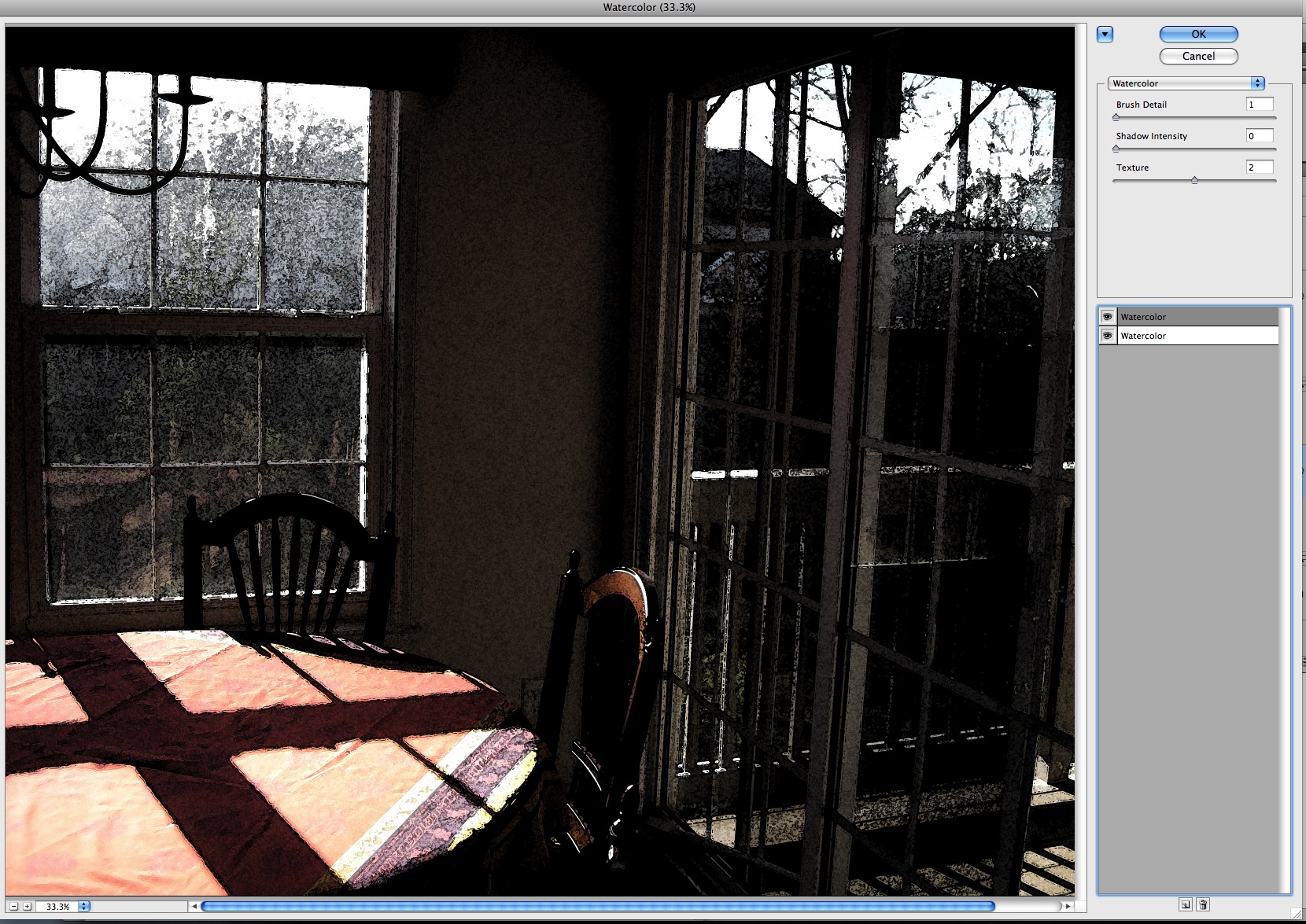
We've also lost almost all color in the windows. There is still a faint cyan tint which can be boosted by adding saturation and a color shift to that color range.
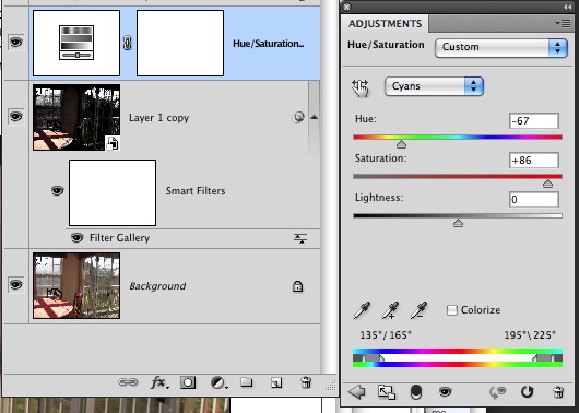
At this point the image looks like this, with a blue/green tint in the window areas.
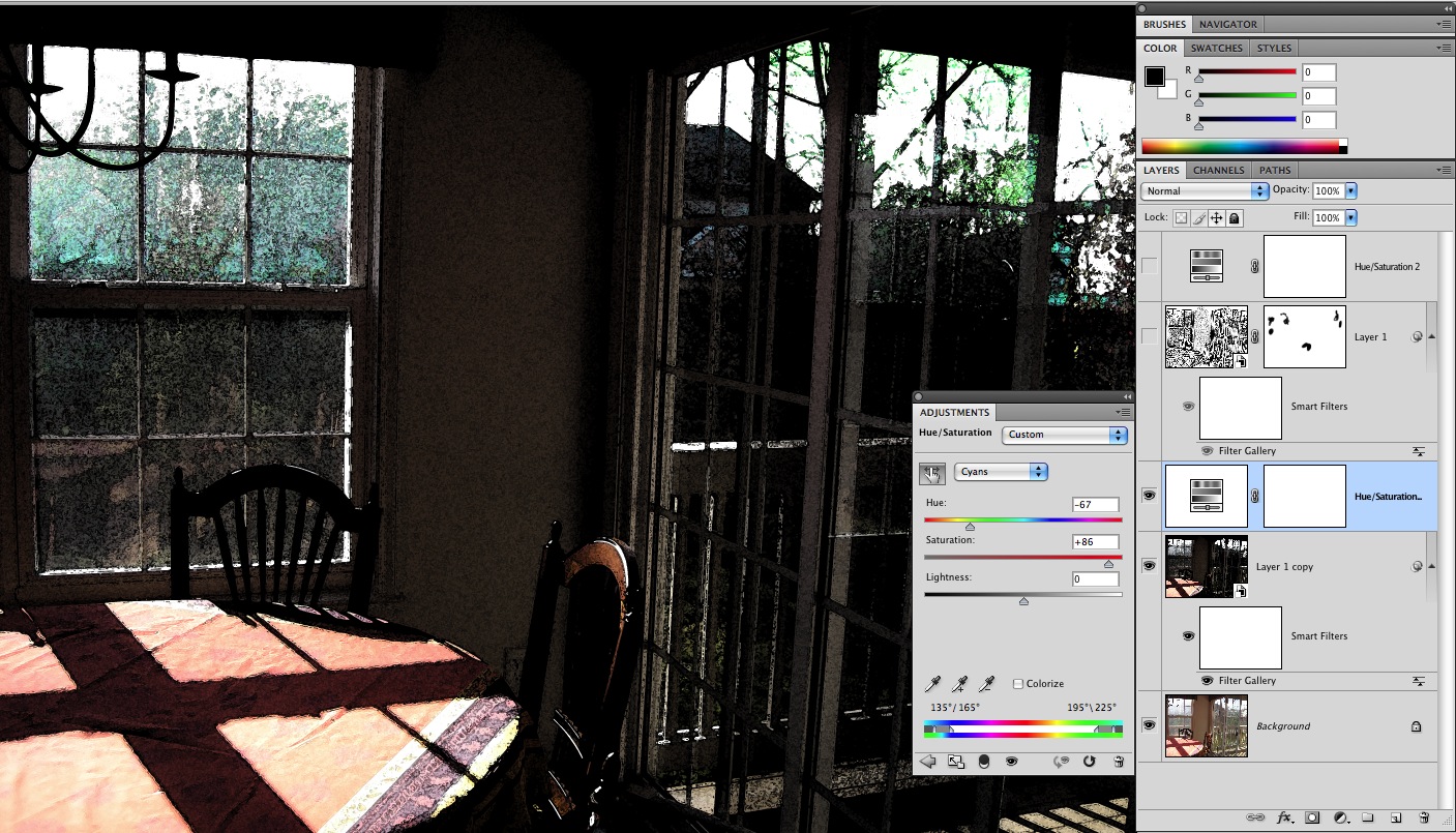
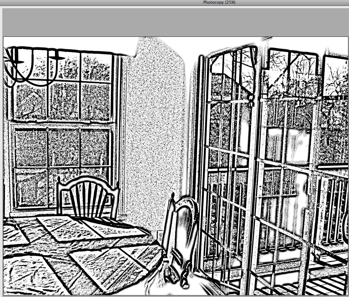
There could still be more textural interest in the tablecloth and windows. I created a new layer, converted it to smart filters and added another multiple filter: Photocopy over Watercolor.


This created a grayscale image that strongly emphasizes the edges of the shadow areas and trees.
I added this in to the picture using the Multiply Blend mode and pulled it back, reducing the layer opacity to 60%.
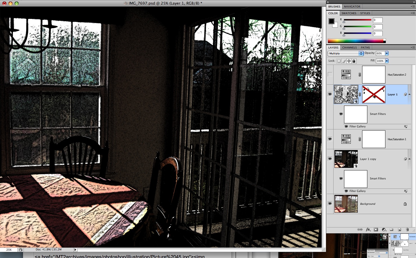
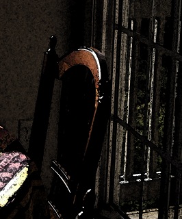
Looking closely at the top of the chair it now looks dirty. The texturing from the grayscale filter went a bit too far in this area and also in the windows: it reduced the amount of color visible there.
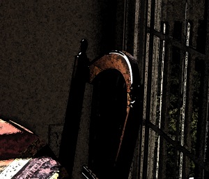
Adding a layer mask to the grayscale filter layer allows this problem to be fixed by simply brushing over areas to hold them out from the added texture.
Here's the back of the chair before applying the mask...
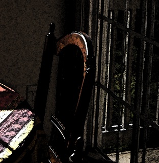
...and after.
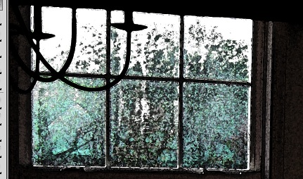
Here's the window area with the mask applied.
One last color boost is now applied, to the red tones in the image: a saturation layer is applied.
Here is the finished picture:
Ads by Google
